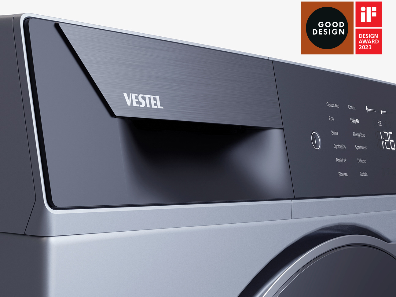
Air Conditioner Remote Control Design
A new series of remote controls for air conditioners with improved user experience
Designed for Vestel
User Experience Design
Product Design
1 year
Project Scope
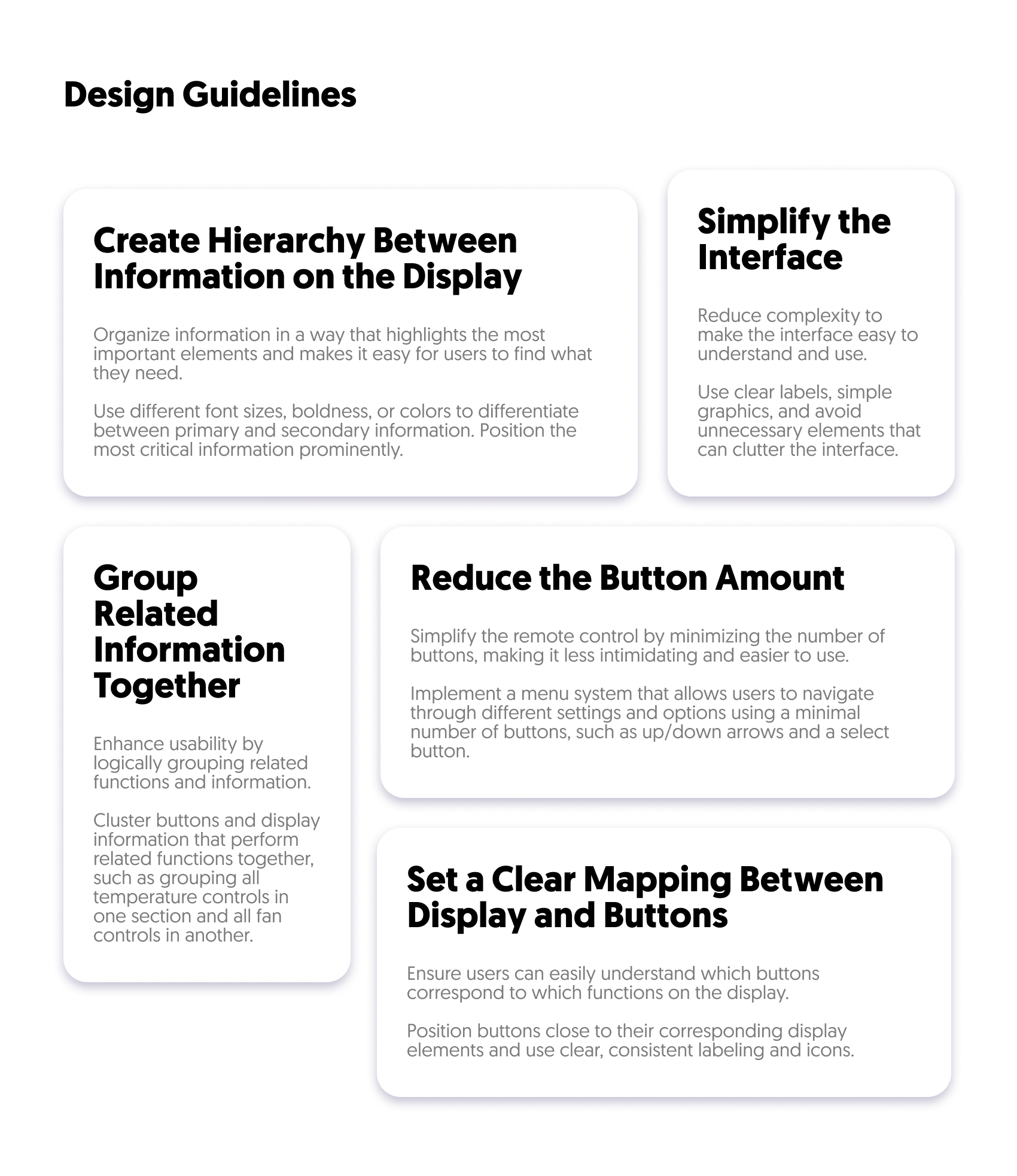
The primary objective was to meet the specific needs of users and the market. This involved simplifying the user interface to alleviate the frustration commonly associated with traditional designs. Clearing up function definitions and organizing buttons in a hierarchical manner aimed to streamline usability. Additionally, improving perceived quality and precision aimed to elevate the overall tactile and visual appeal of the remote control.
By addressing these aspects comprehensively, the project aimed to deliver an intuitive, efficient, and visually appealing remote control solution for air conditioners.
By addressing these aspects comprehensively, the project aimed to deliver an intuitive, efficient, and visually appealing remote control solution for air conditioners.

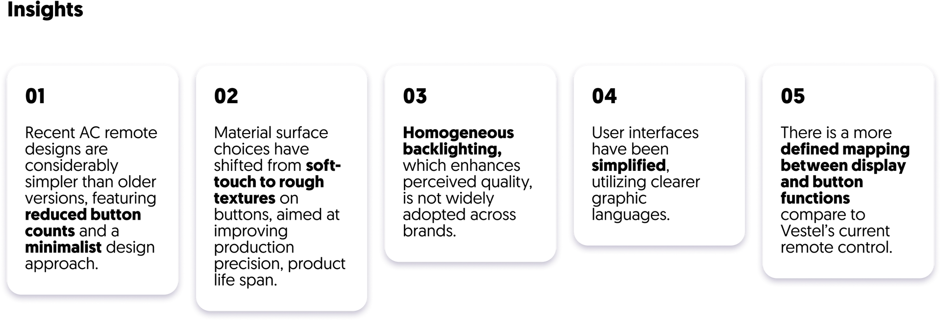
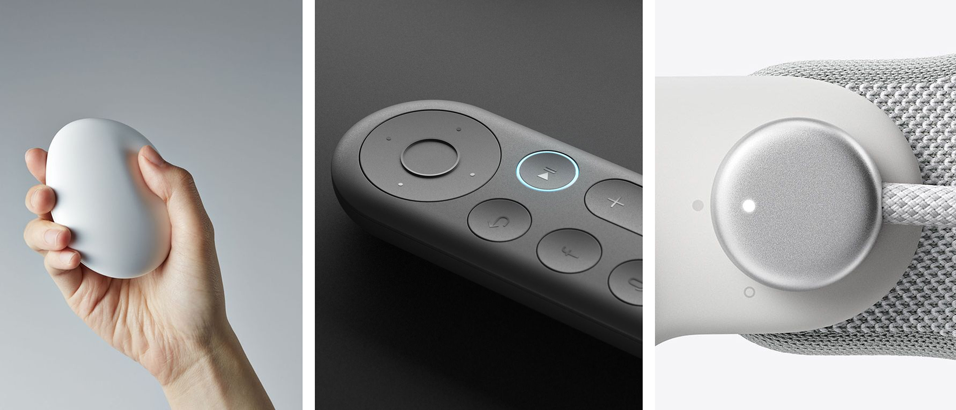
Key Trends
Broader design and technological trends, including the rise of smart home systems, minimalist aesthetics, and the demand for customizable elements like color and material options, were analyzed to guide the design direction and ensure alignment with current and future market expectations.
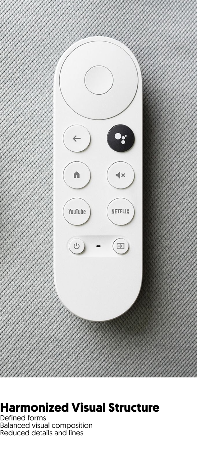
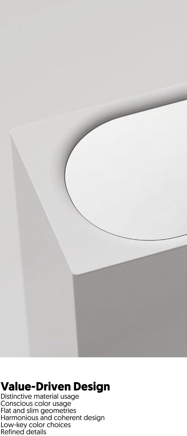
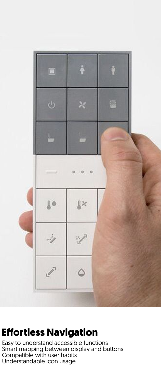
Key design principles emphasized clean and purposeful forms, balanced visual composition, and reduced complexity through simplified details and lines. Distinctive materials, a refined and low-key color palette, and flat, slim geometries contributed to a modern and cohesive aesthetic. Consistency in design language was achieved through harmonious compositions and refined details, while user-centered features such as intuitive iconography, smart mapping between the display and buttons, and compatibility with established user habits ensured functionality and ease of use.
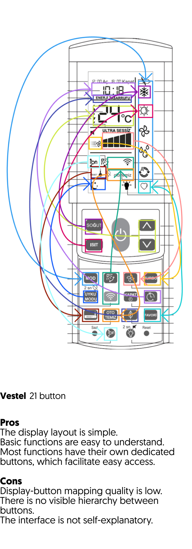
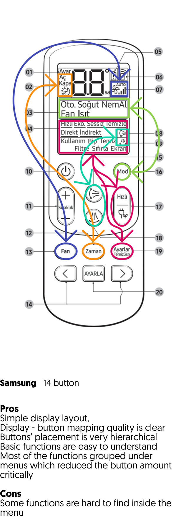
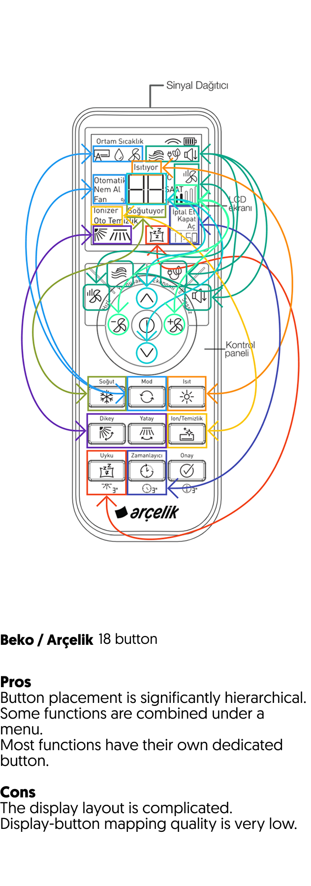
Competitor Analysis
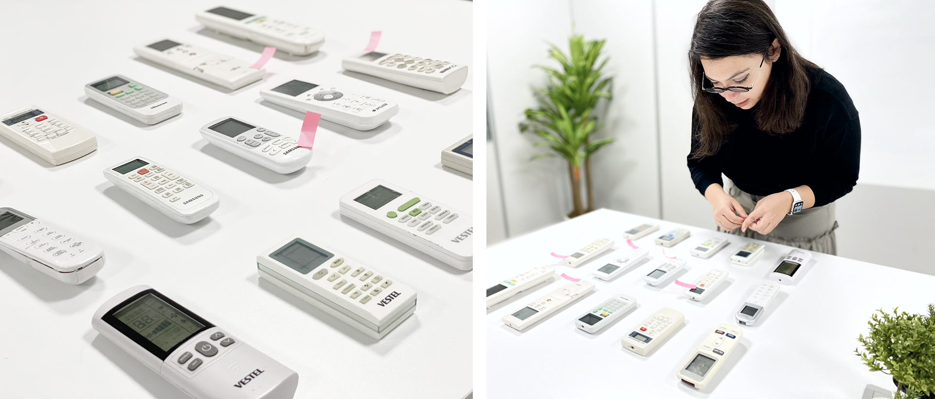
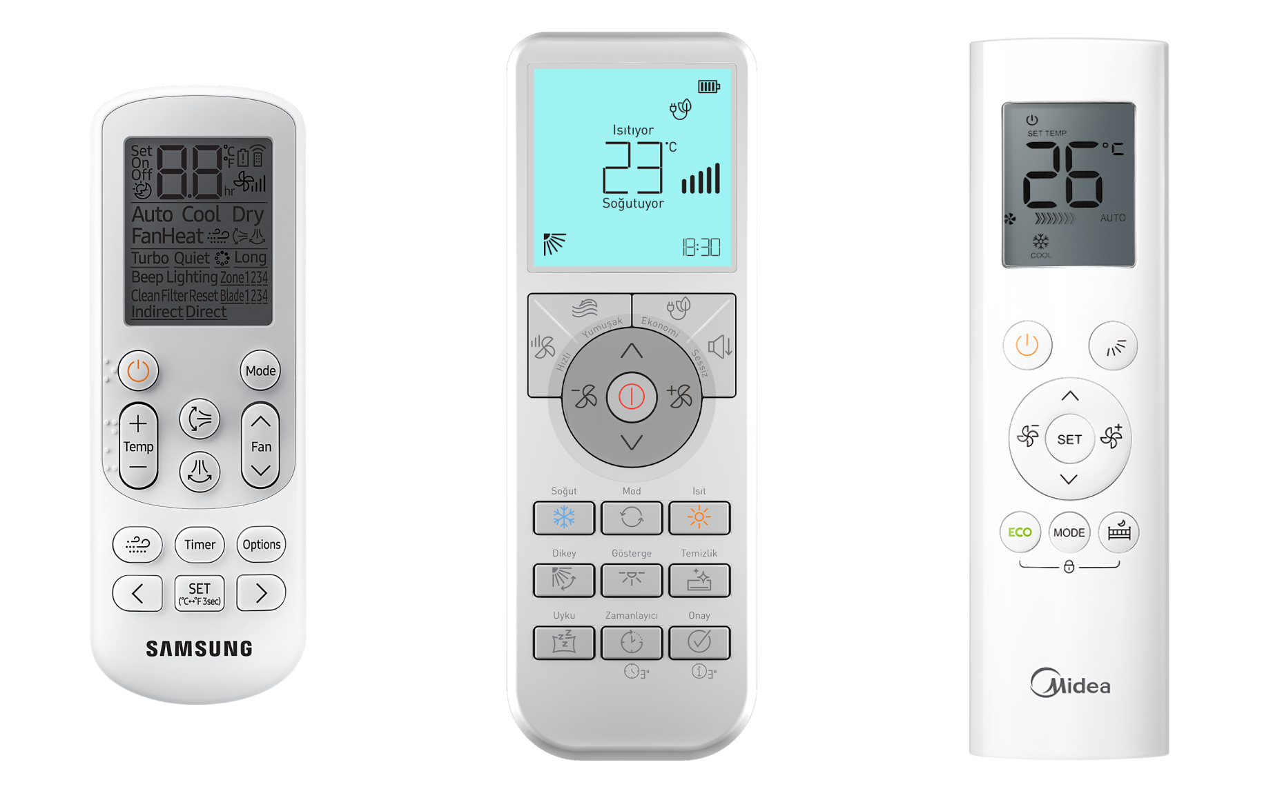
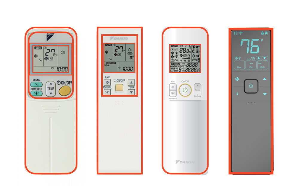
An in-depth review of the competitive landscape was conducted, examining over 25 brands, including current and older remote control models from companies such as Samsung, Daikin, Mitsubishi, Panasonic, Midea, Xiaomi, Haier, and Beko. This analysis evaluated common features, usability approaches, and form factors, highlighting user priorities such as intuitive layouts, enhanced functionality, and seamless visual integration with modern interiors.
Visual Analysis of Competitors
We gathered insights from key competitors in the market by comparing their appearance and design approaches.
User Interaction Analysis of Competitors
We gathered insights from key competitors in the market by comparing their interfaces, button structure and information architectures
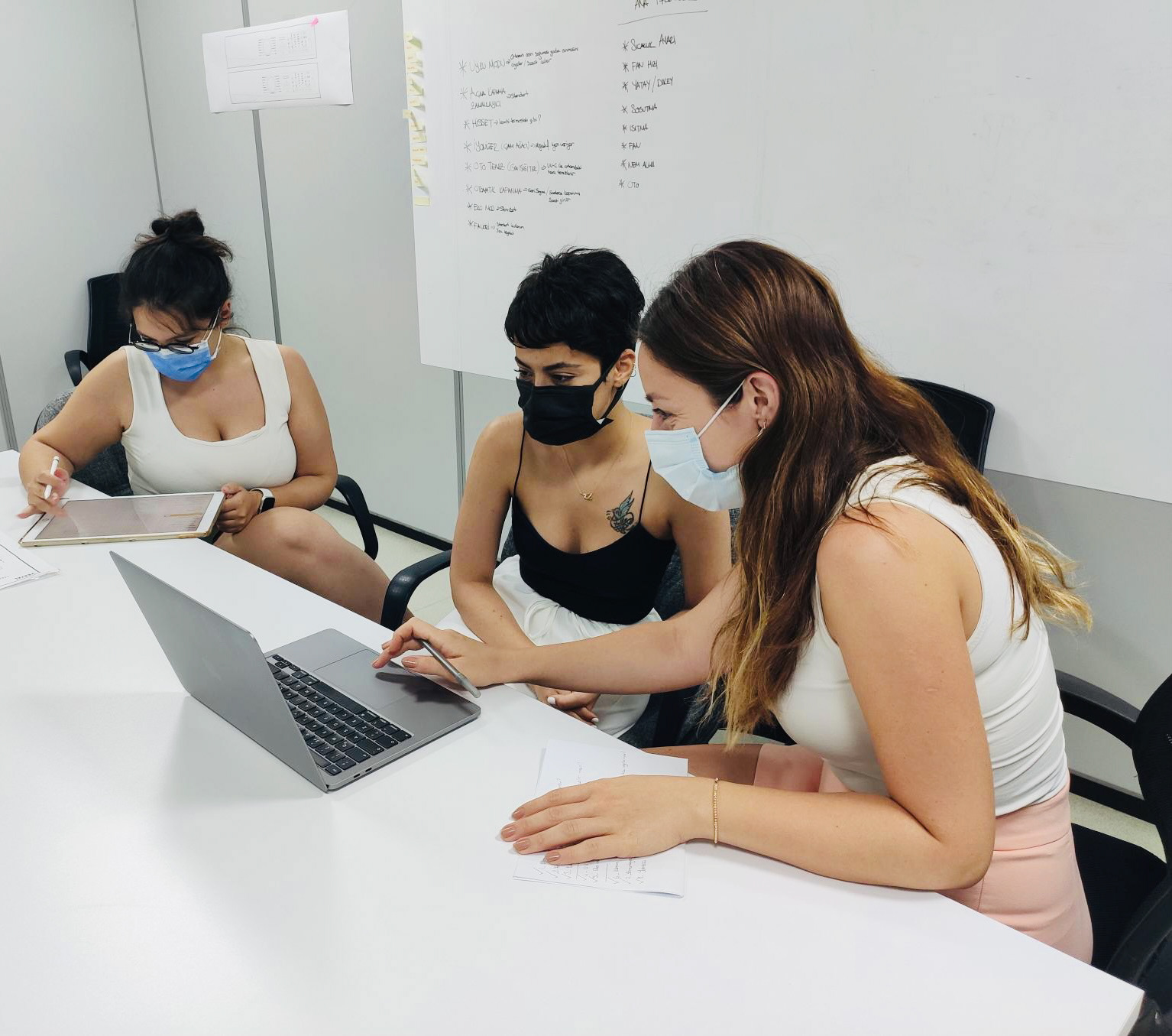
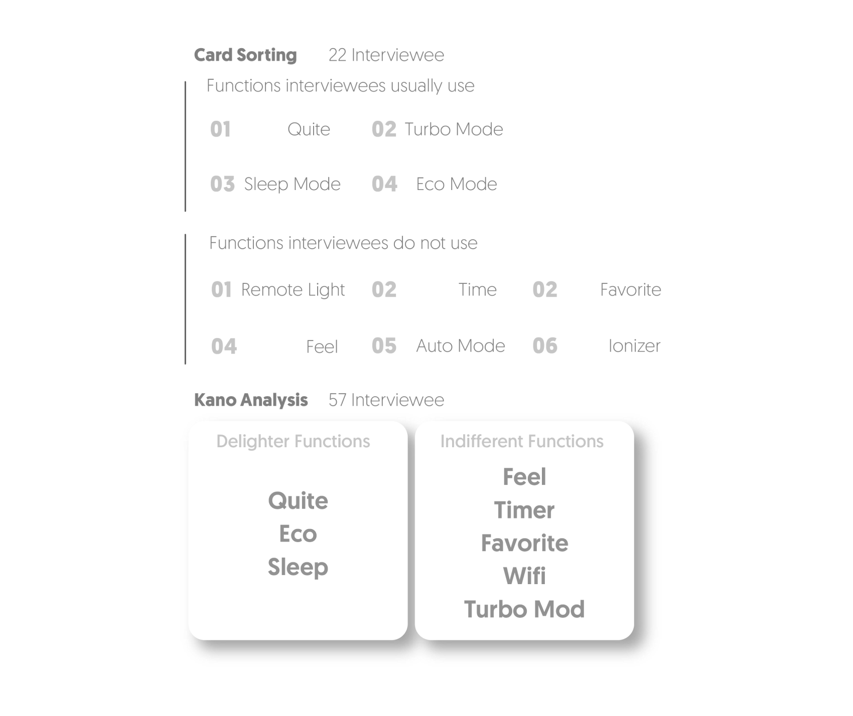
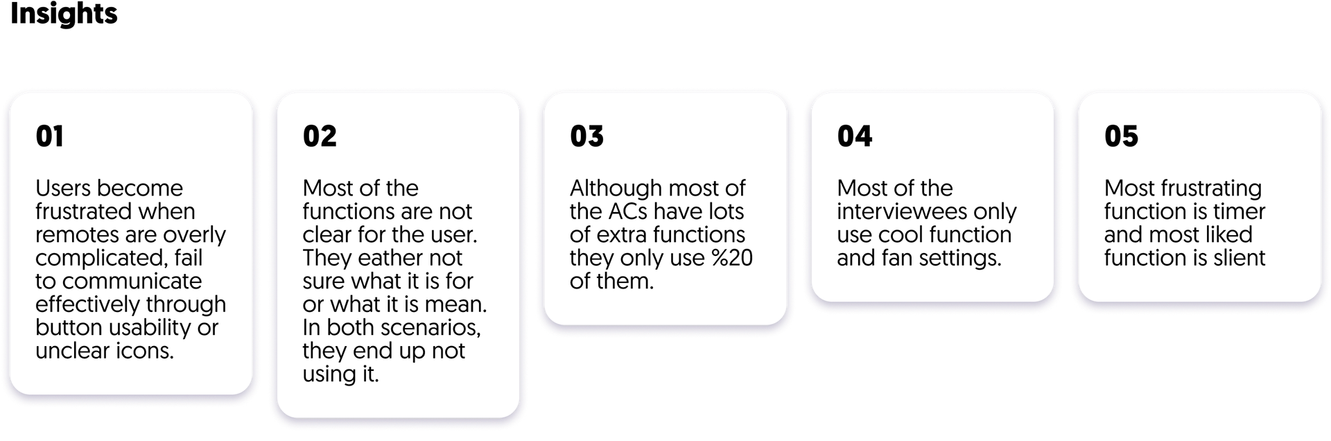
User Interviews
During user research, we employed various methods to understand user habits, preferences, and how effectively the product communicates with them. We carefully selected a diverse range of interviewees to mitigate potential biases.
Re-Designing
User Experience
After gathering the necessary information, we established design guidelines and specifications based on the insights we obtained.
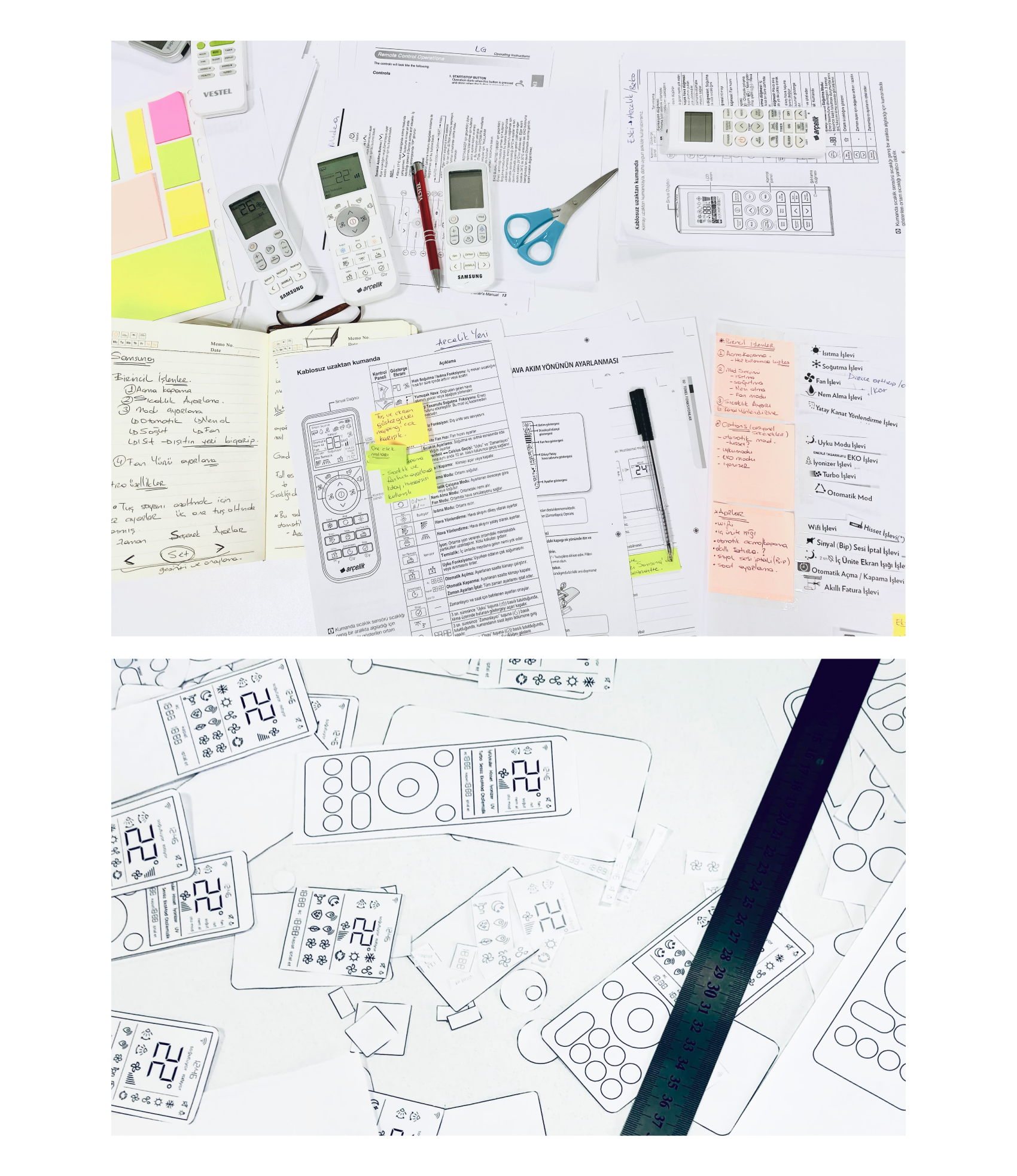
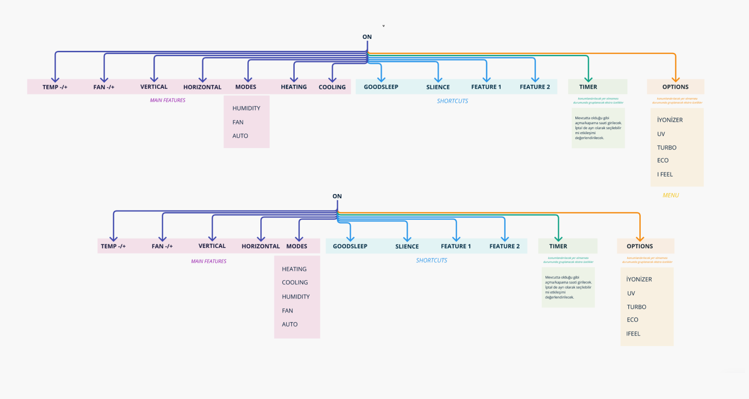
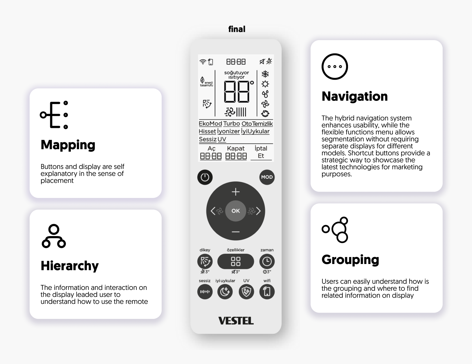
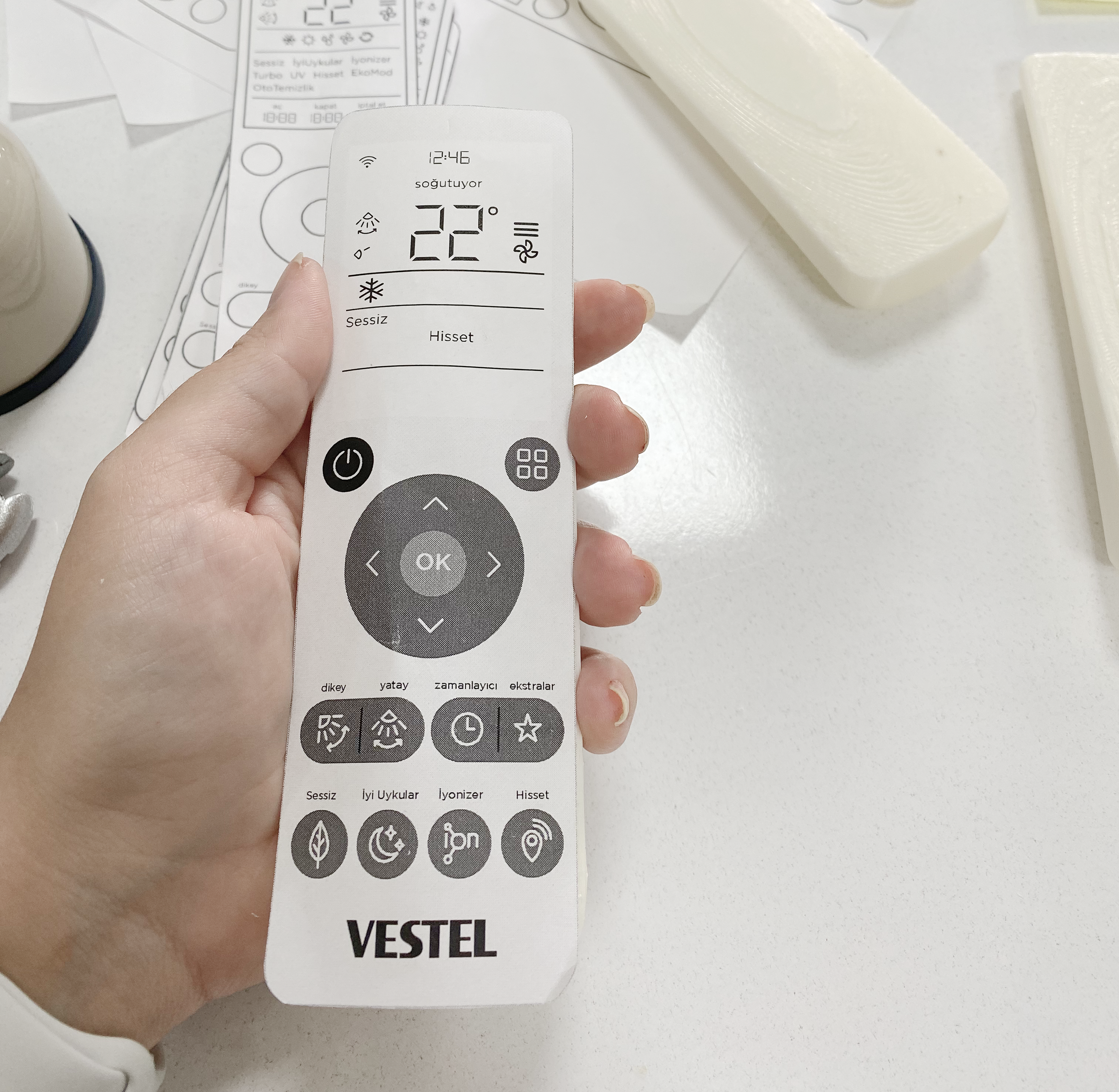
Information Architecture
The new usage flow, designed as a hybrid system, combines a flexible interface - that allows to segmentation- with quick shortcuts for frequently used functions.
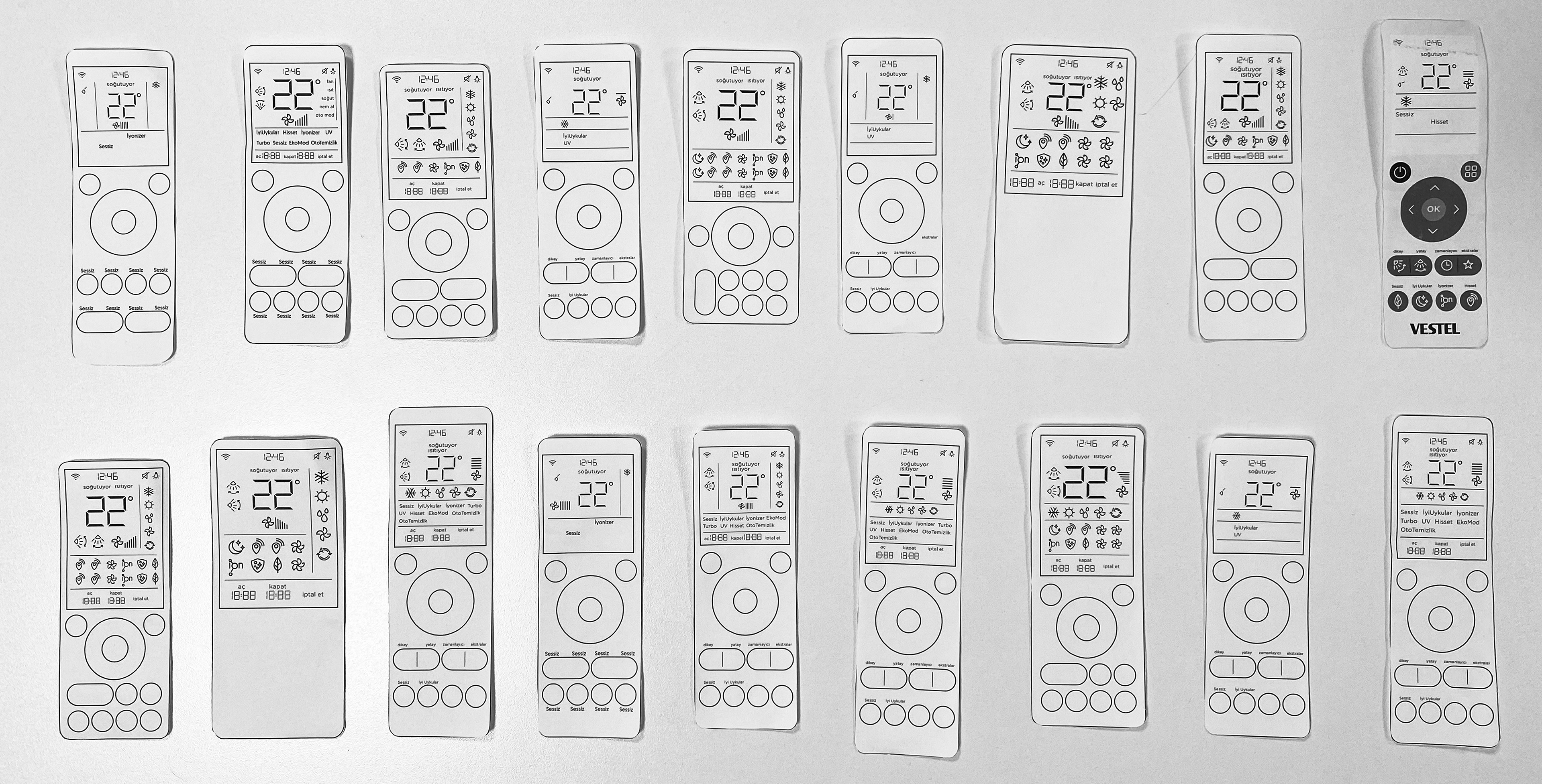
It has been created in multiple versions and tested on 12 people. The design was revised and tested three times with different users.
It has been created in multiple versions and tested on 12 people. The design was revised and tested three times with different users.
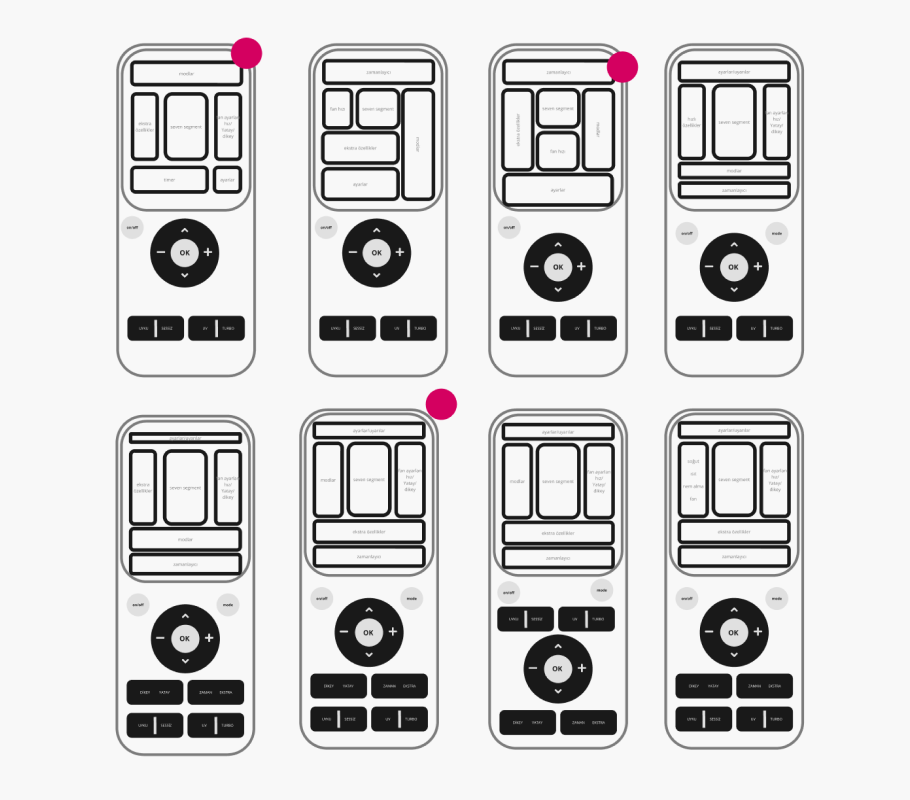
User Interface Concept Development
During the concept development phase, our team adhered to established design guidelines to innovate new methods of interacting with the air conditioner. We streamlined the user experience by simplifying the interface and eliminating unnecessary, complicated settings, prioritizing frequently used features. Additionally, we integrated the marketing team's requirements by strategically placing buttons for new technologies and features, ensuring both functionality and market appeal.
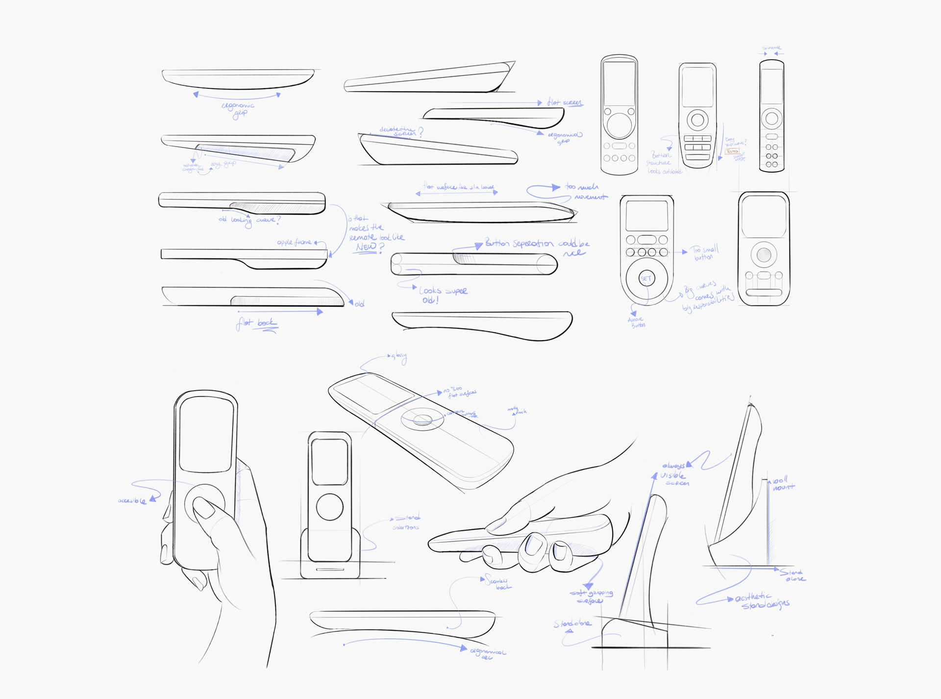
Form Analysis
Relationships
Before ideating on the form, we established design guidelines for various elements of the remote control, creating a common language for the project.
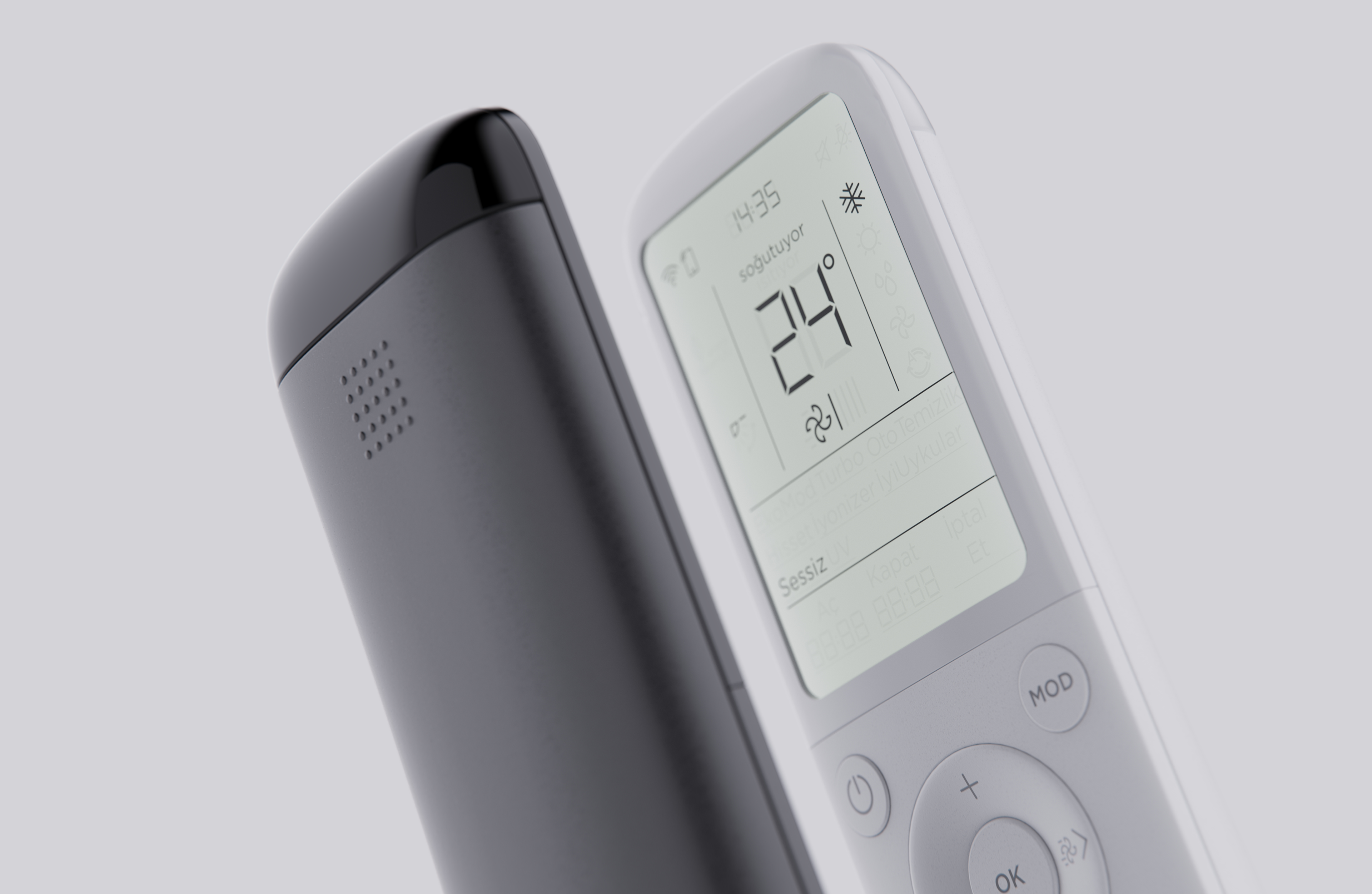
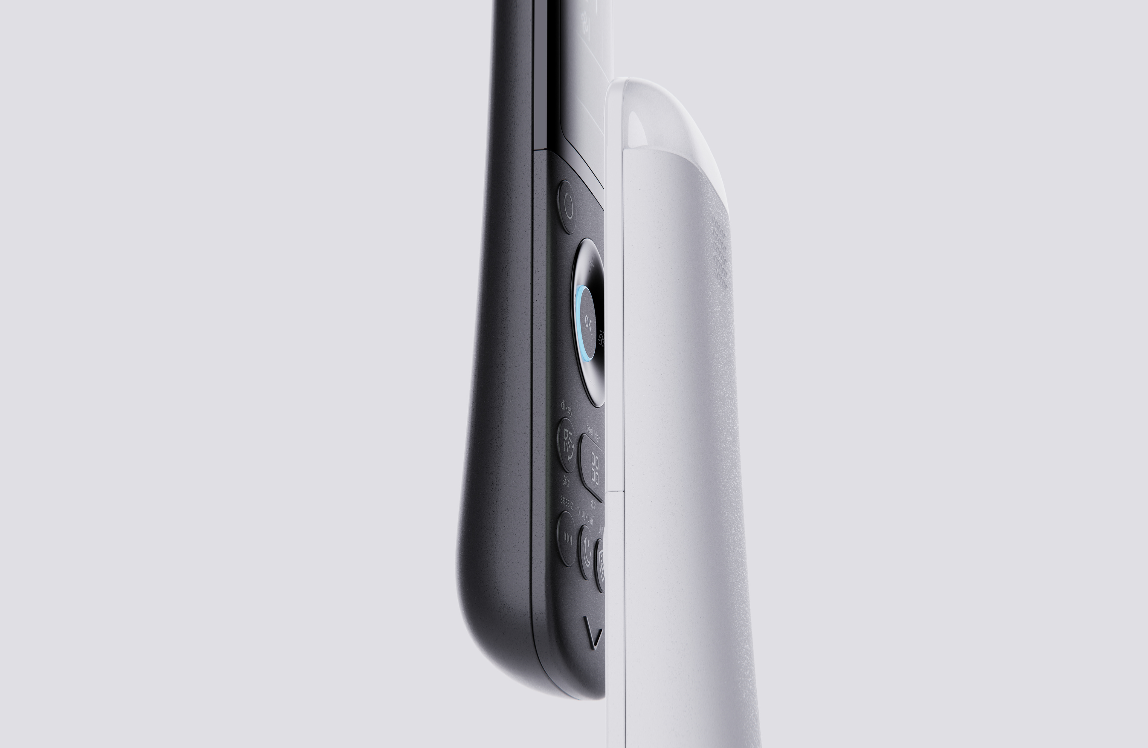
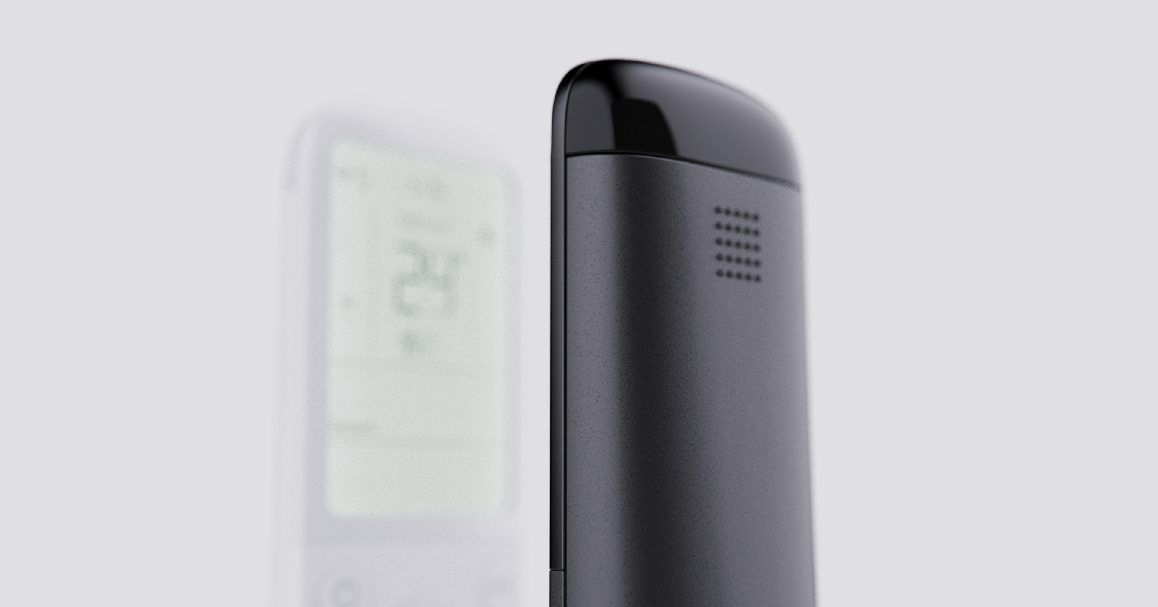
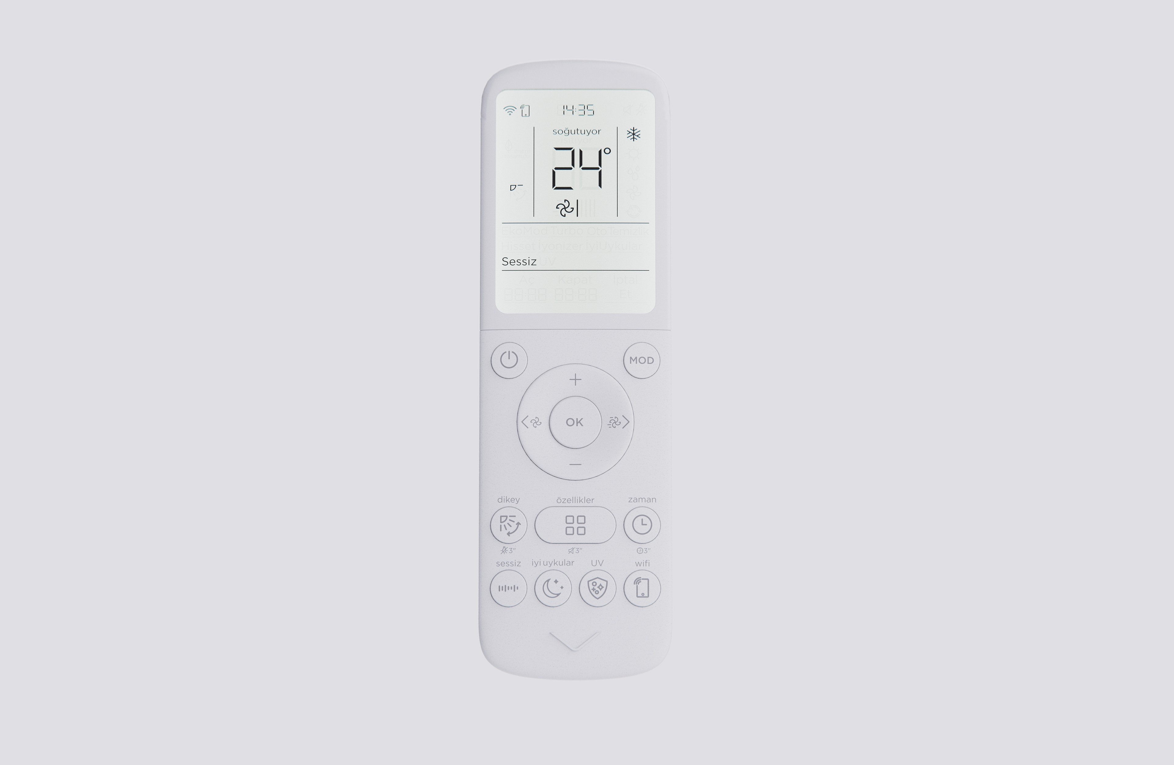
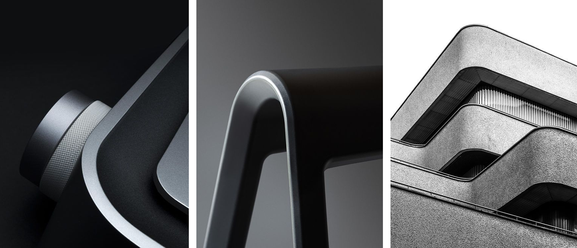
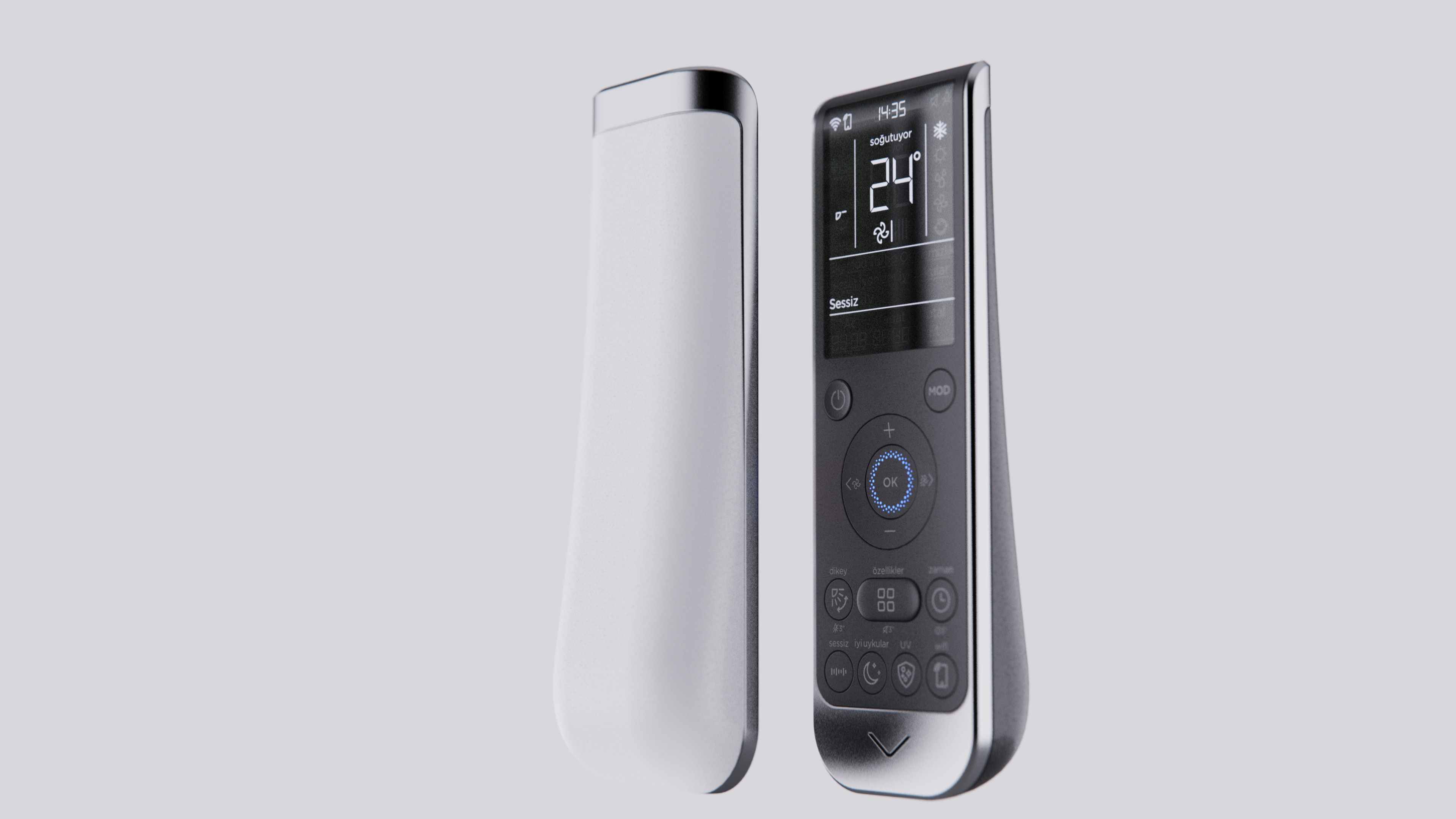
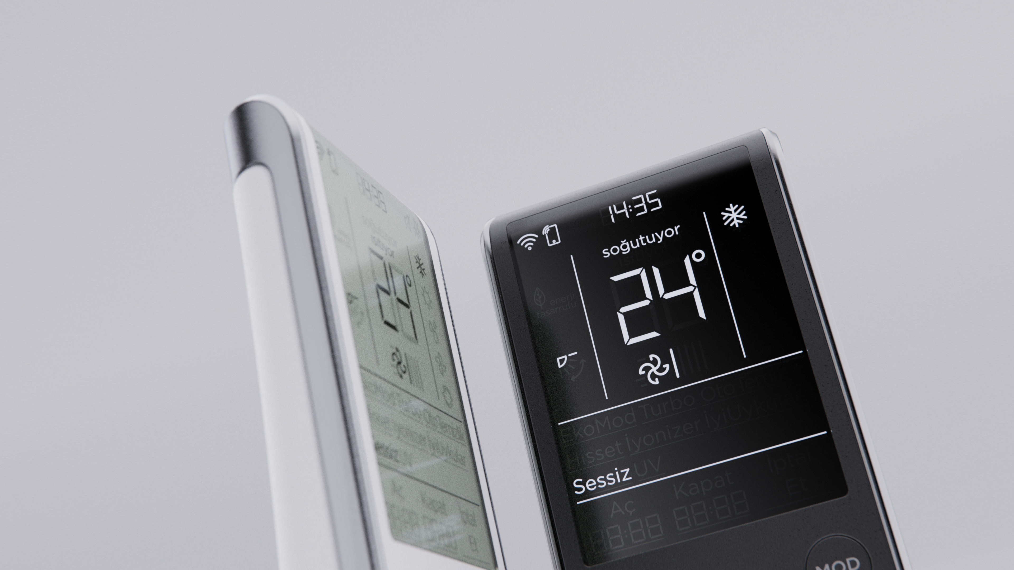
Overall Form-Display
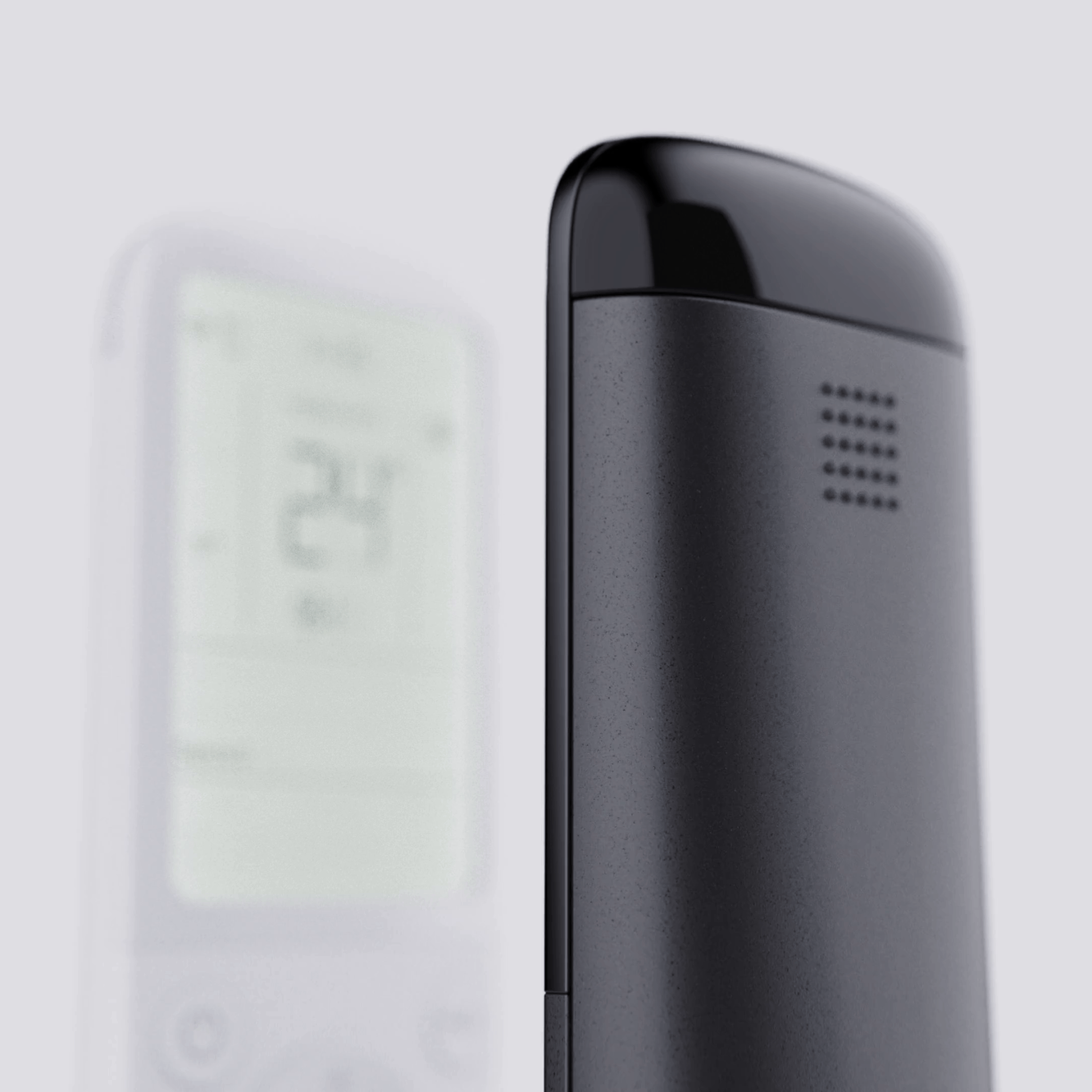
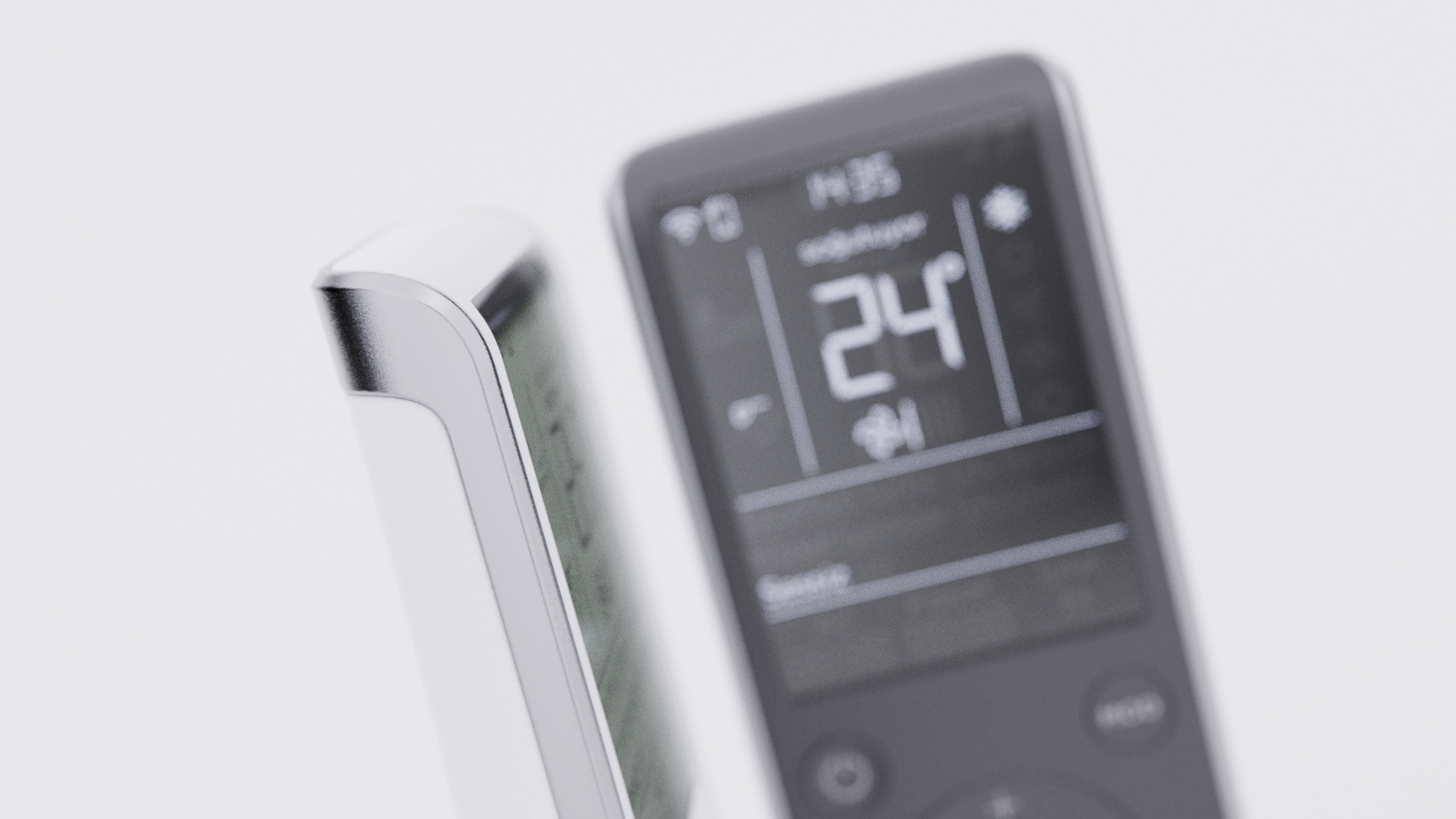
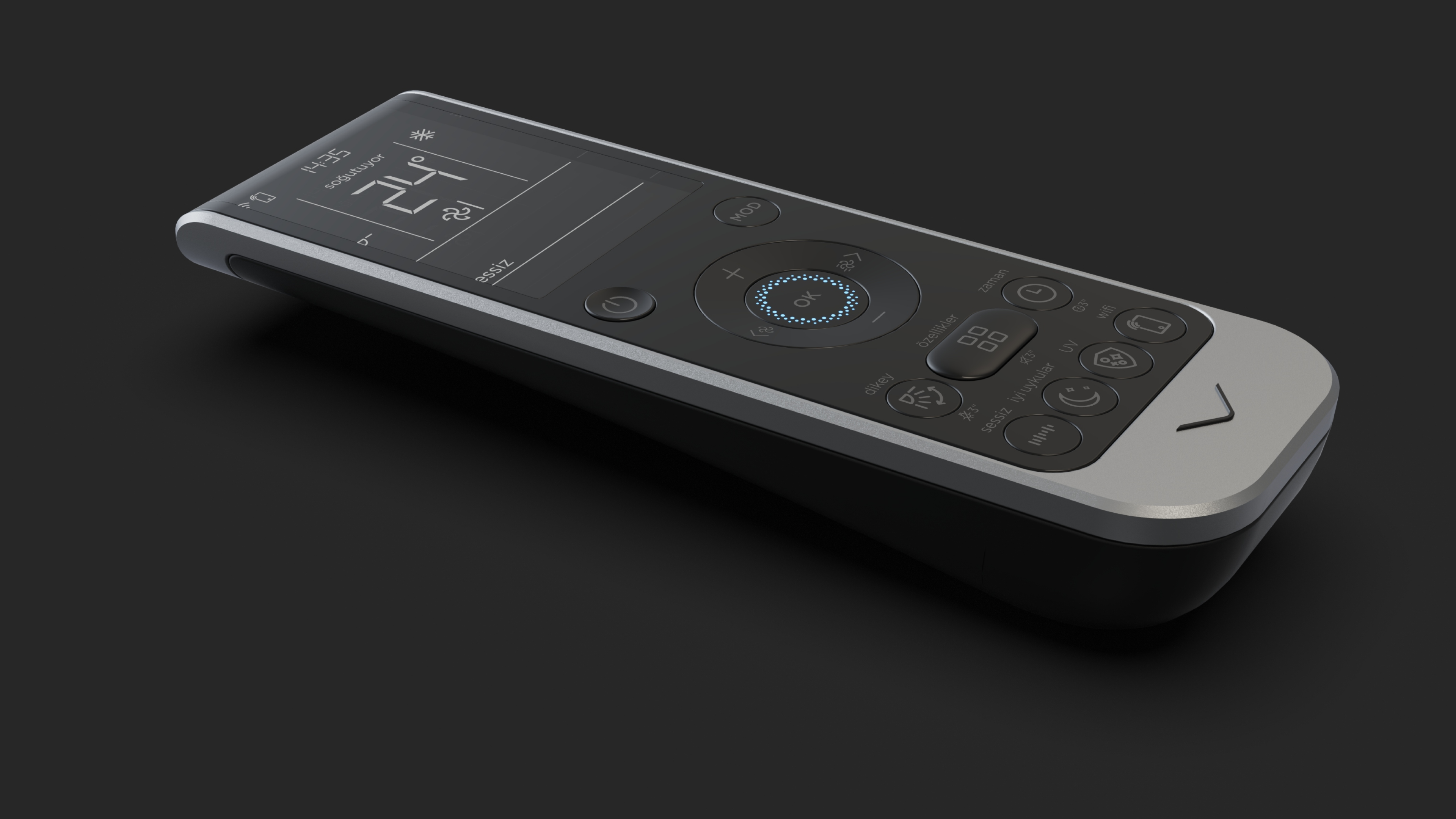
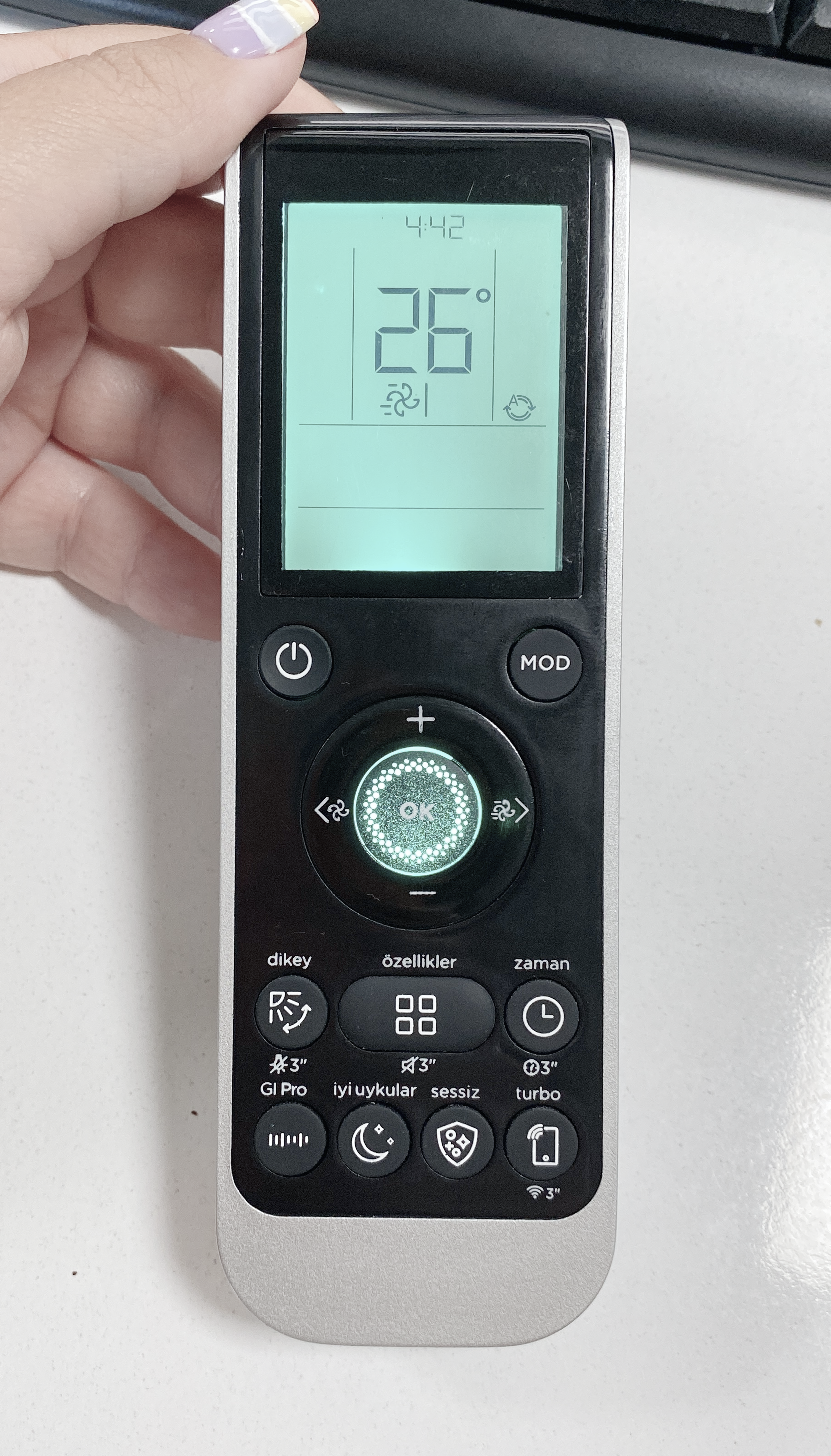
The strategic reduction of parting lines and the adoption of thinner screen frames significantly enhance the remote control's technological appeal. Furthermore, the use of slim seven-segment fonts contributes to a sleek, modern, and high-tech look, aligning with contemporary design trends and user expectations.
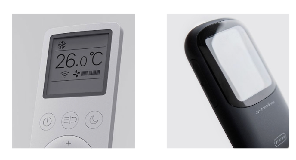
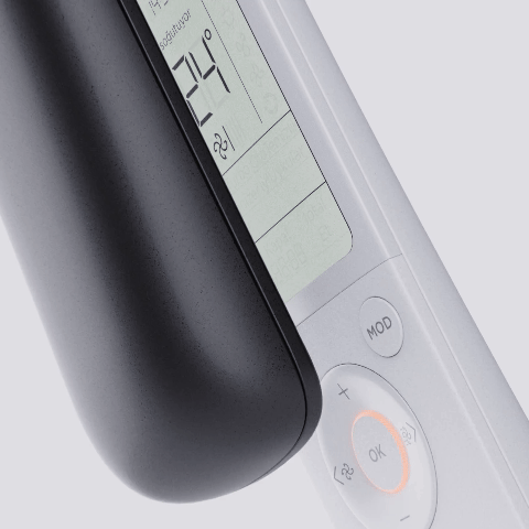
Display Lens
When the display screen lens is flat, it is perceived as more modern and technological. This flat design allows for a reduced distance between the display and the lens, which is not possible with 3D forms like concave or convex lenses.
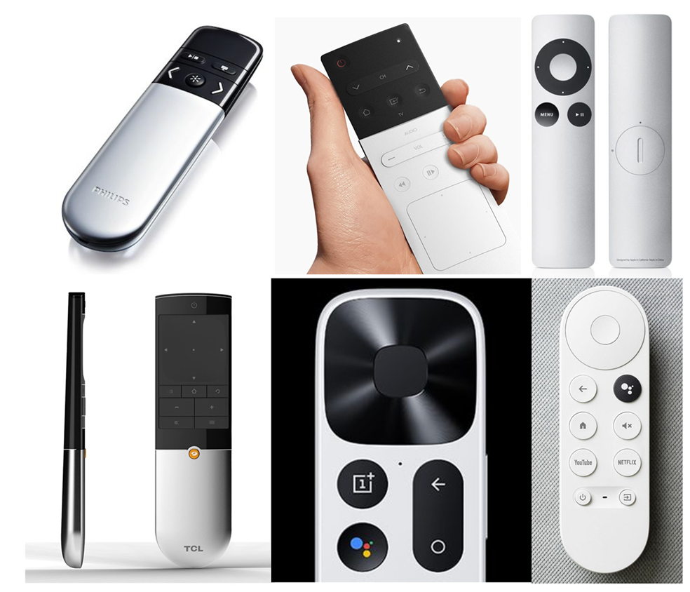
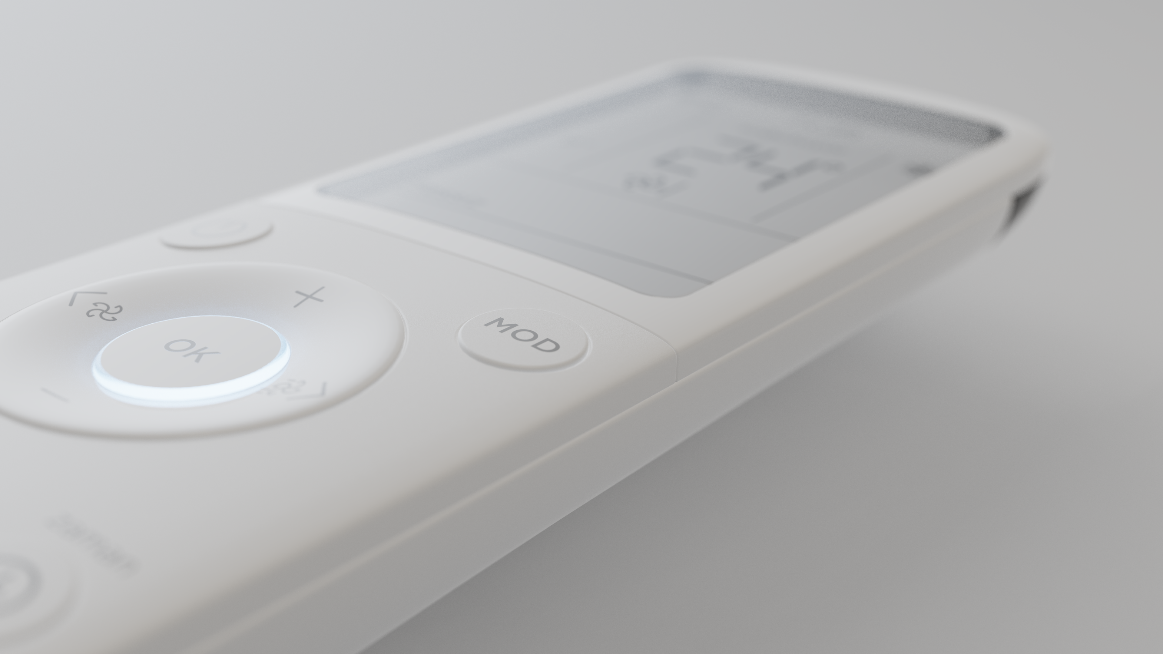
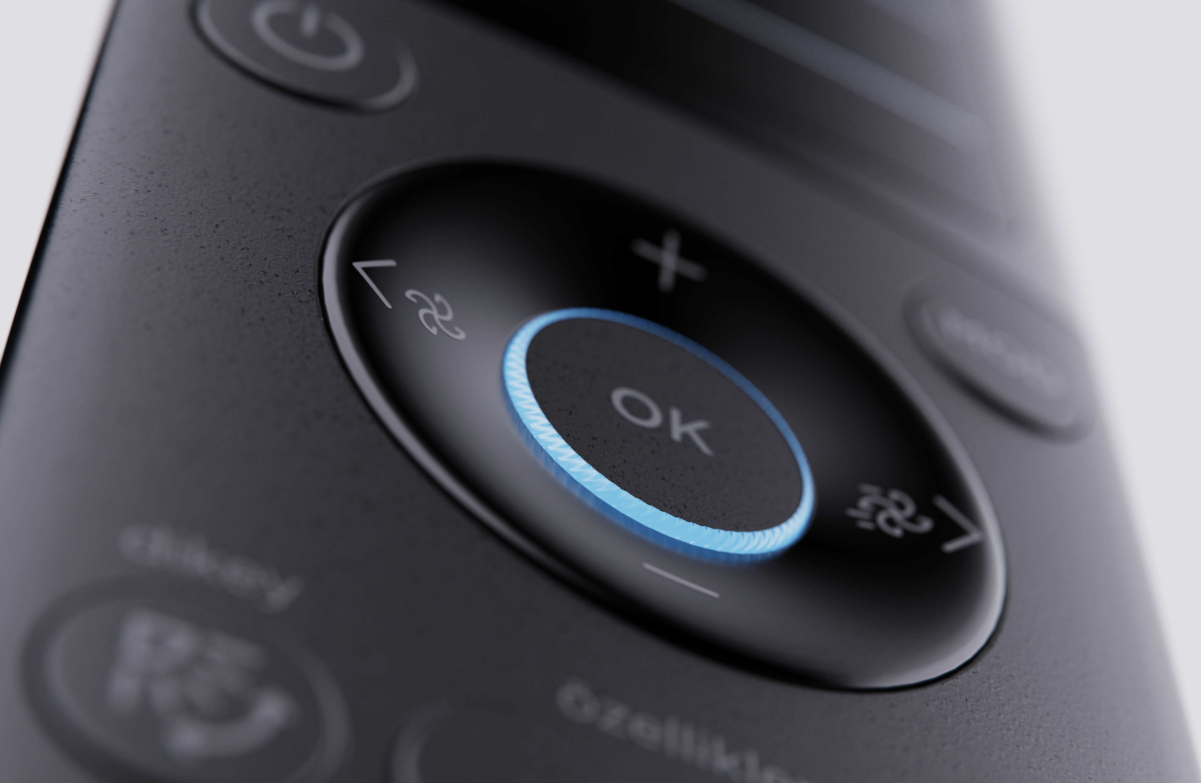
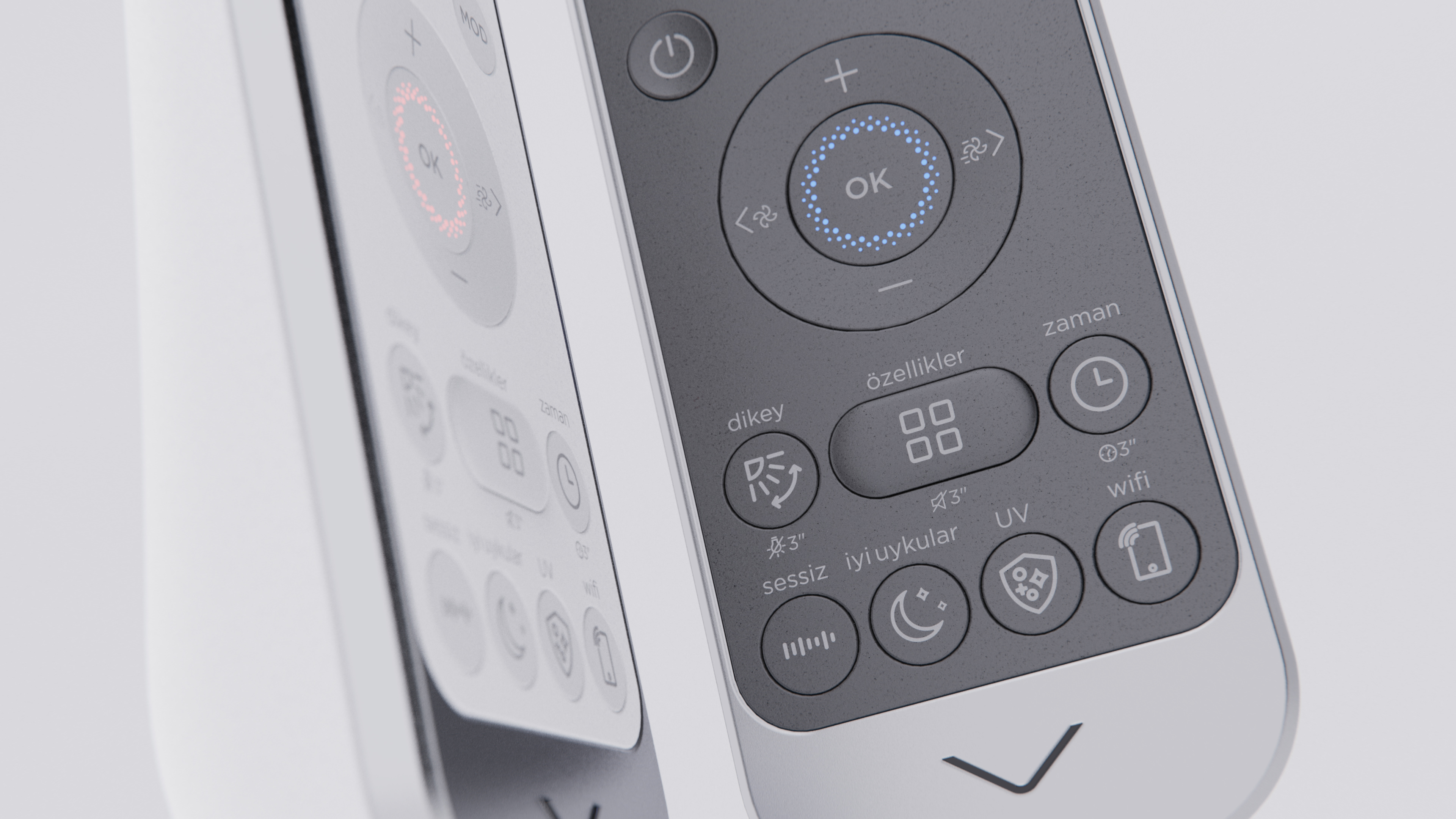
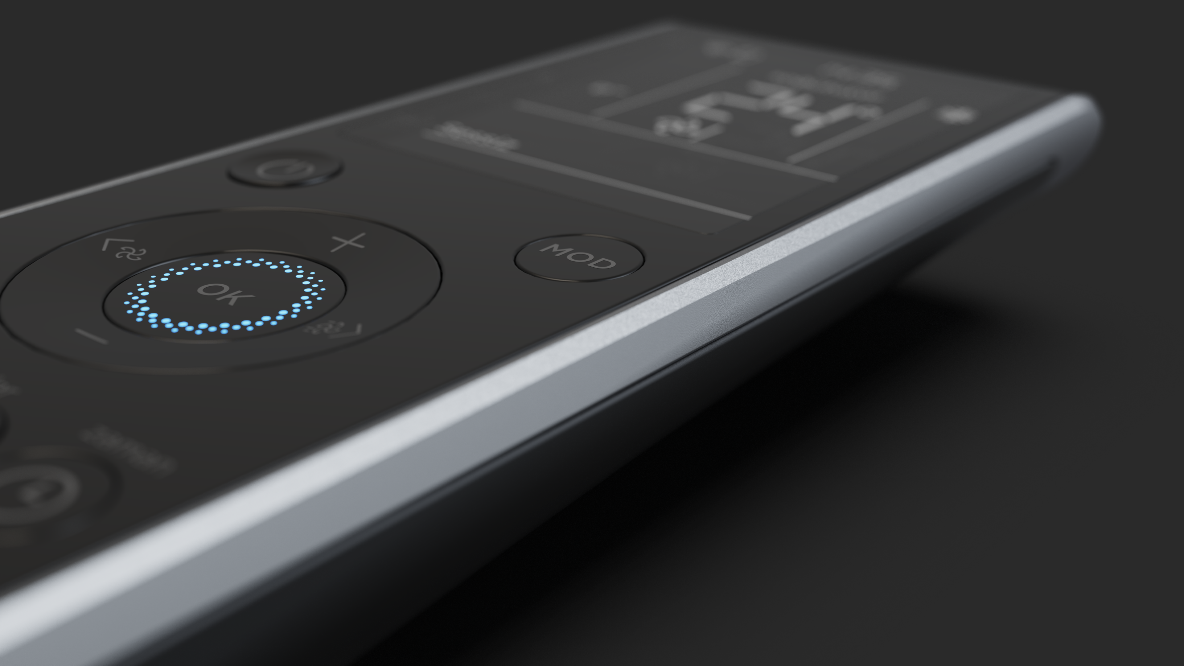
Button Structure
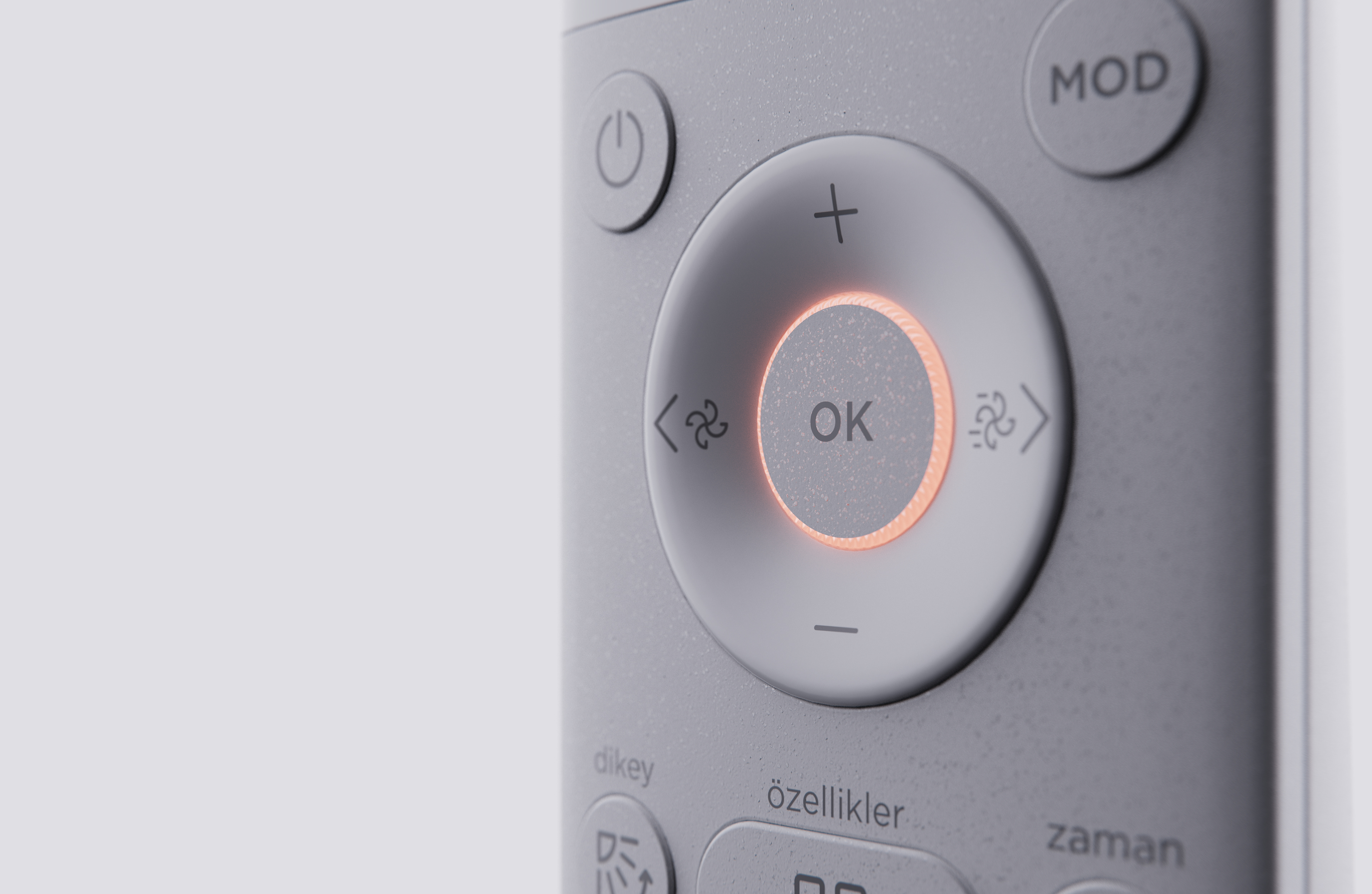
Flush-mounted buttons help maintain a sleek and modern appearance. Different surface finishes can be effectively used to differentiate between functions by providing tactile feedback. Smaller button strokes enhance the perceived quality of the remote control. Additionally, using contrasting colors for call-to-action interactions, such as on/off buttons, can improve usability and intuitiveness.
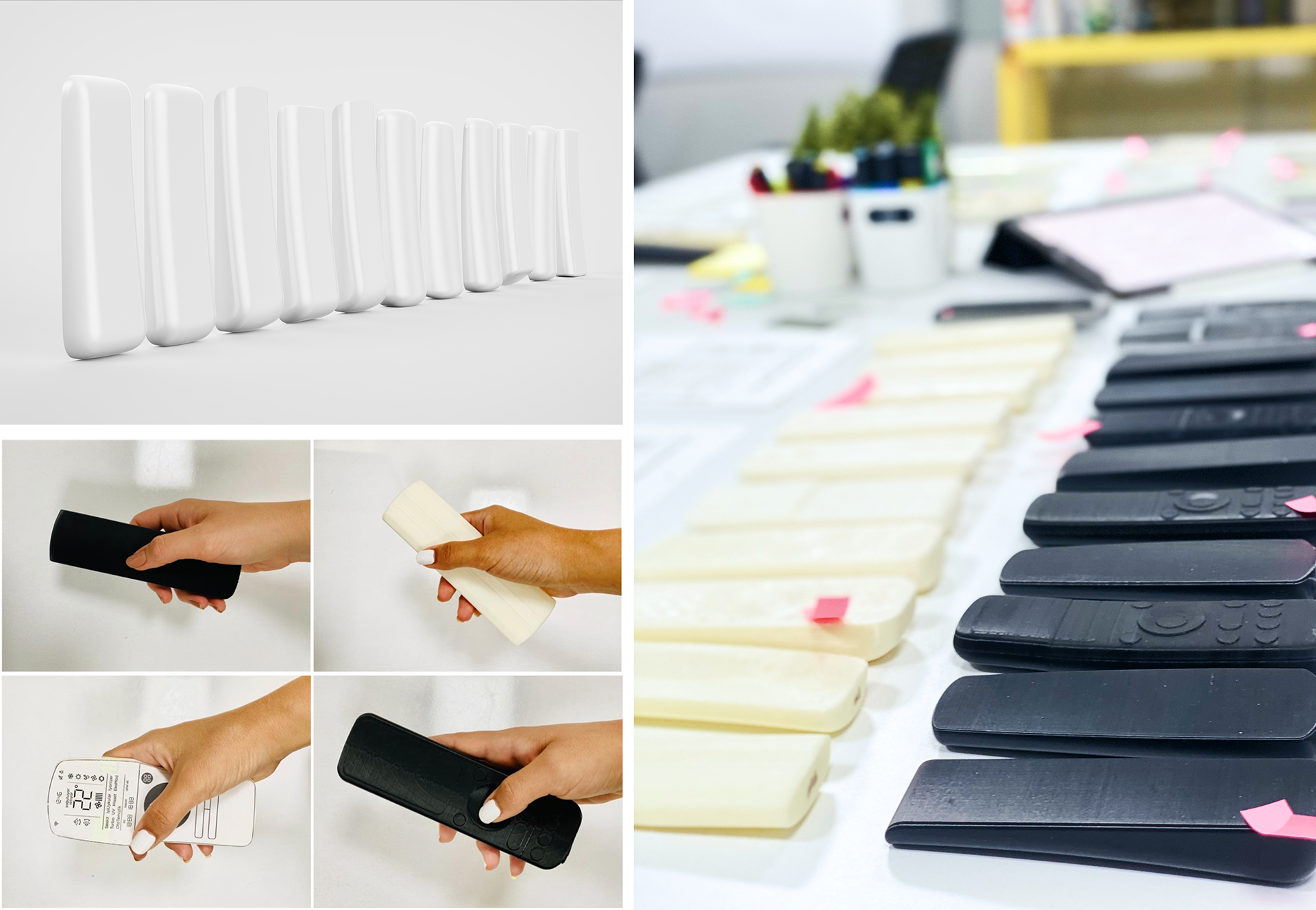
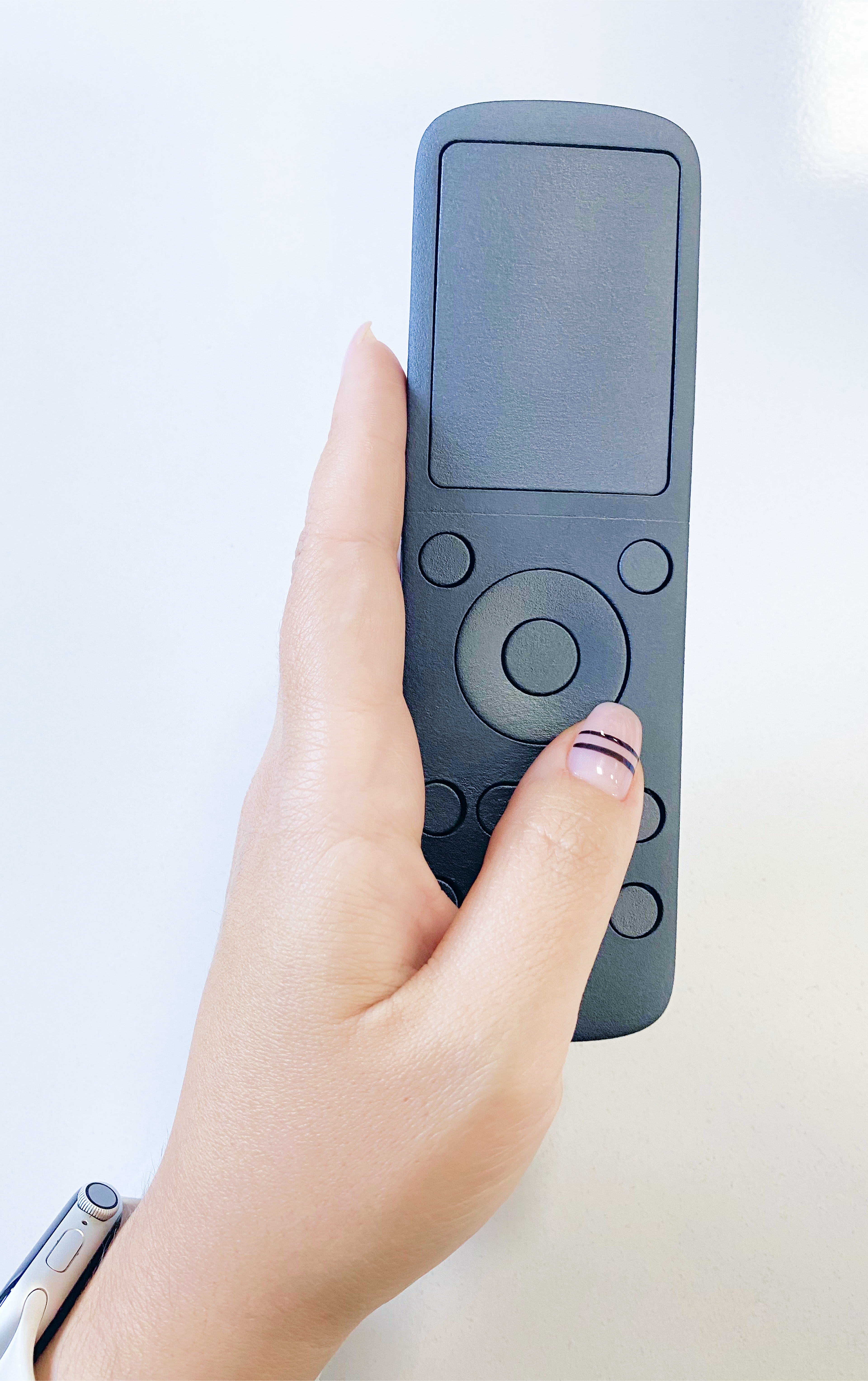
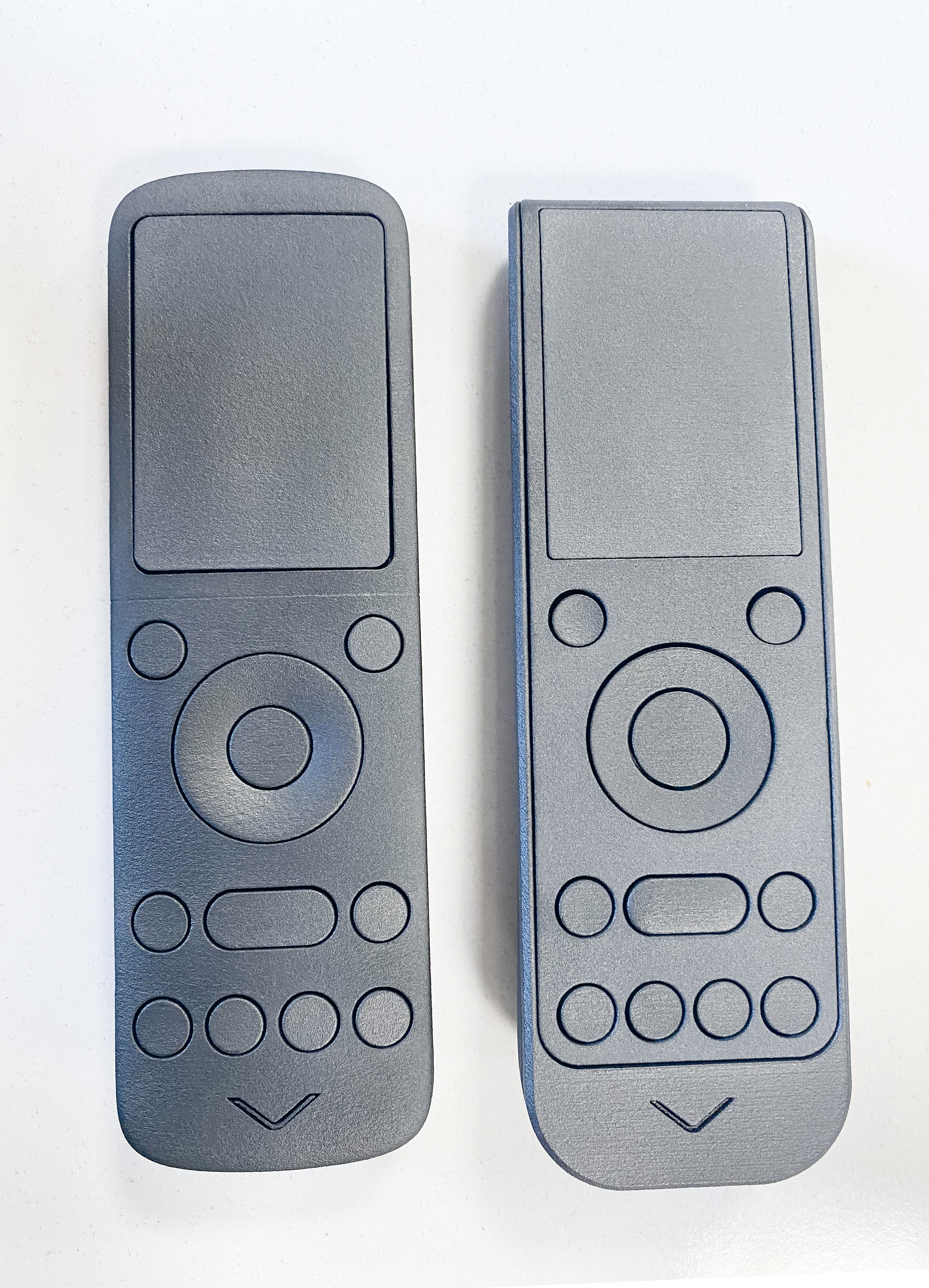
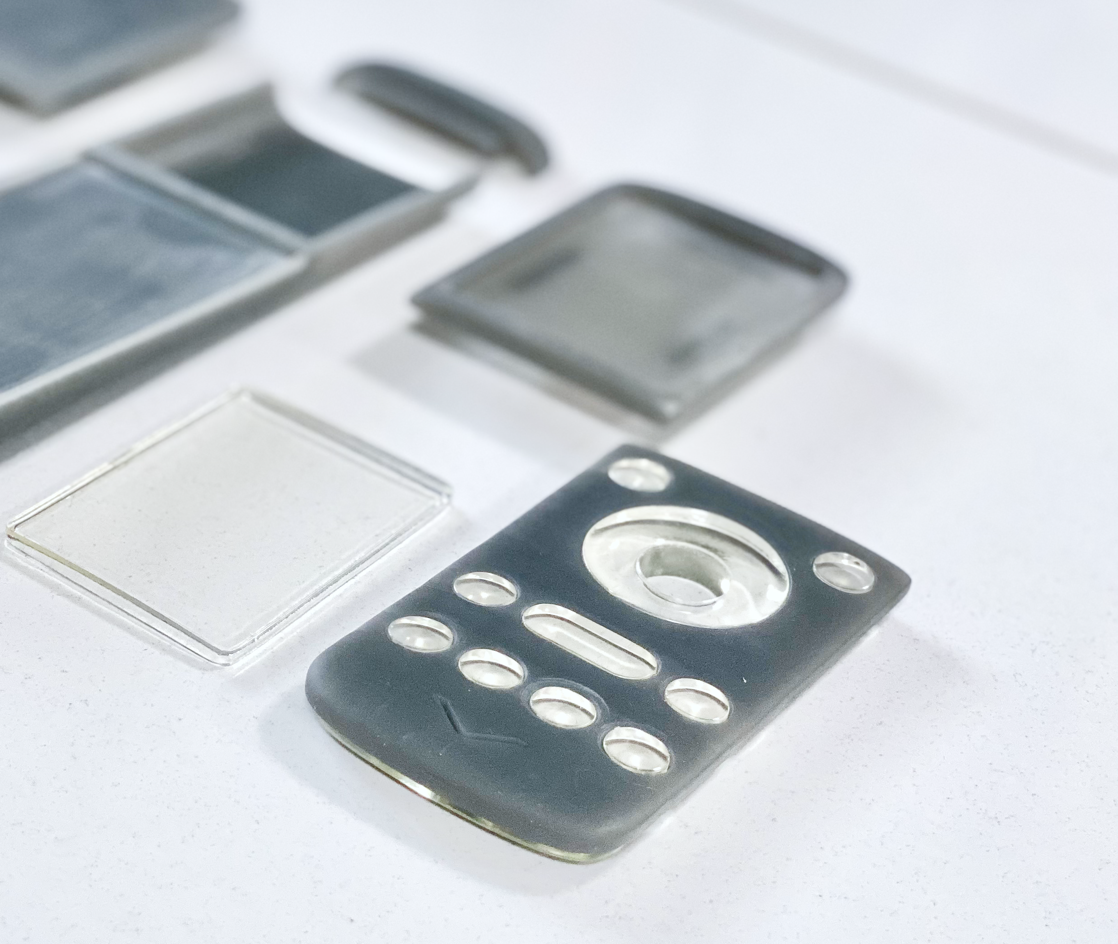
Form Exploration
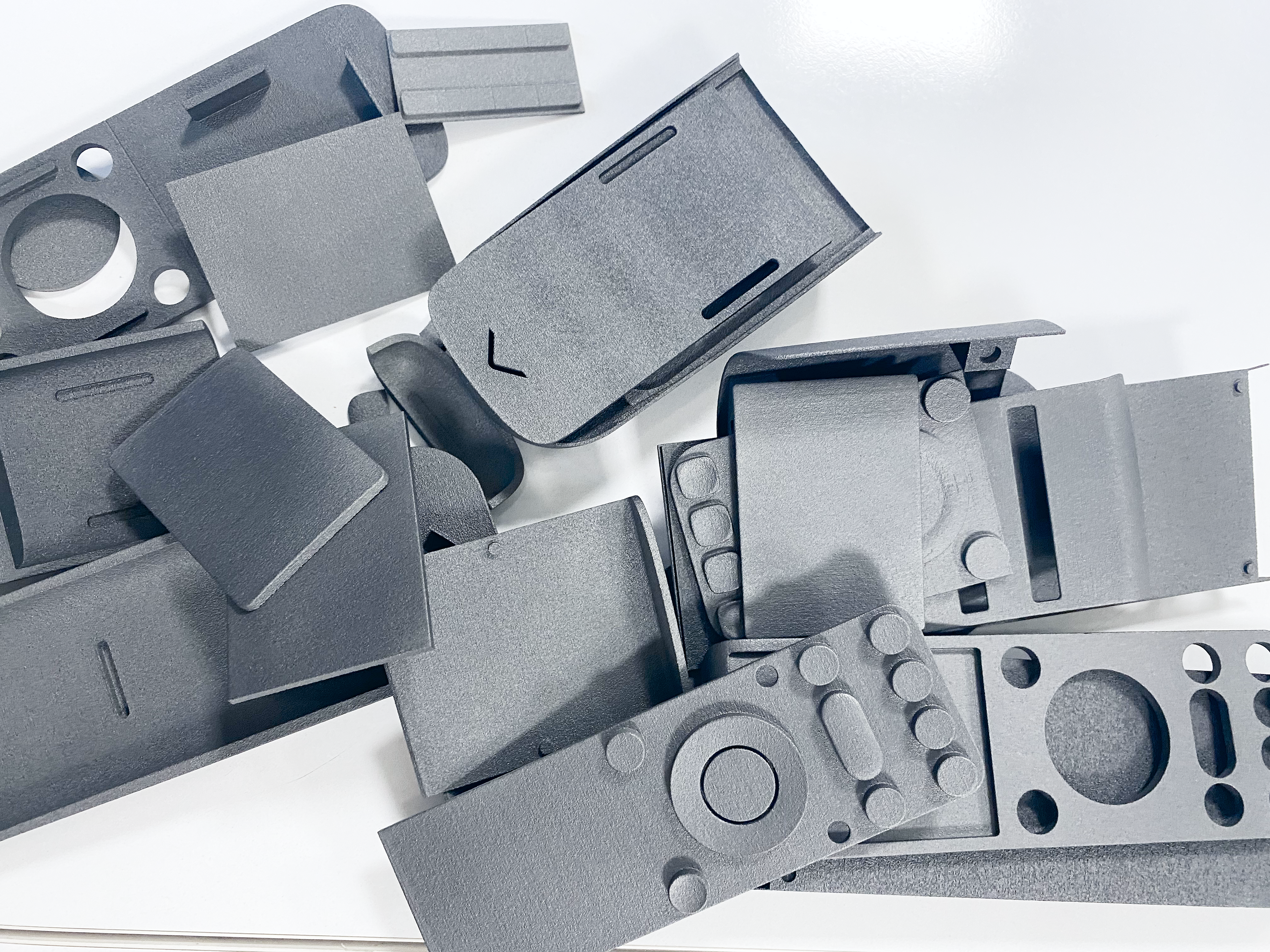
The ergonomics of the remote control were assessed through user interaction studies with multiple prototypes. Participants were instructed to handle
3D-printed models, and their interactions with different designs were meticulously observed. The design iterations were refined based on user feedback and expert evaluations, leading to a selection of optimized options.
3D-printed models, and their interactions with different designs were meticulously observed. The design iterations were refined based on user feedback and expert evaluations, leading to a selection of optimized options.
Concept Development
Following extensive research on interface and form explorations, two concepts were developed, both aligning with user needs, market demands, and technical constraints. Each concept takes a different approach to solving the same problems, creating two distinct design routes that address usability and functionality from unique perspectives.
Route 01
Timeless, Soft, Harmonious
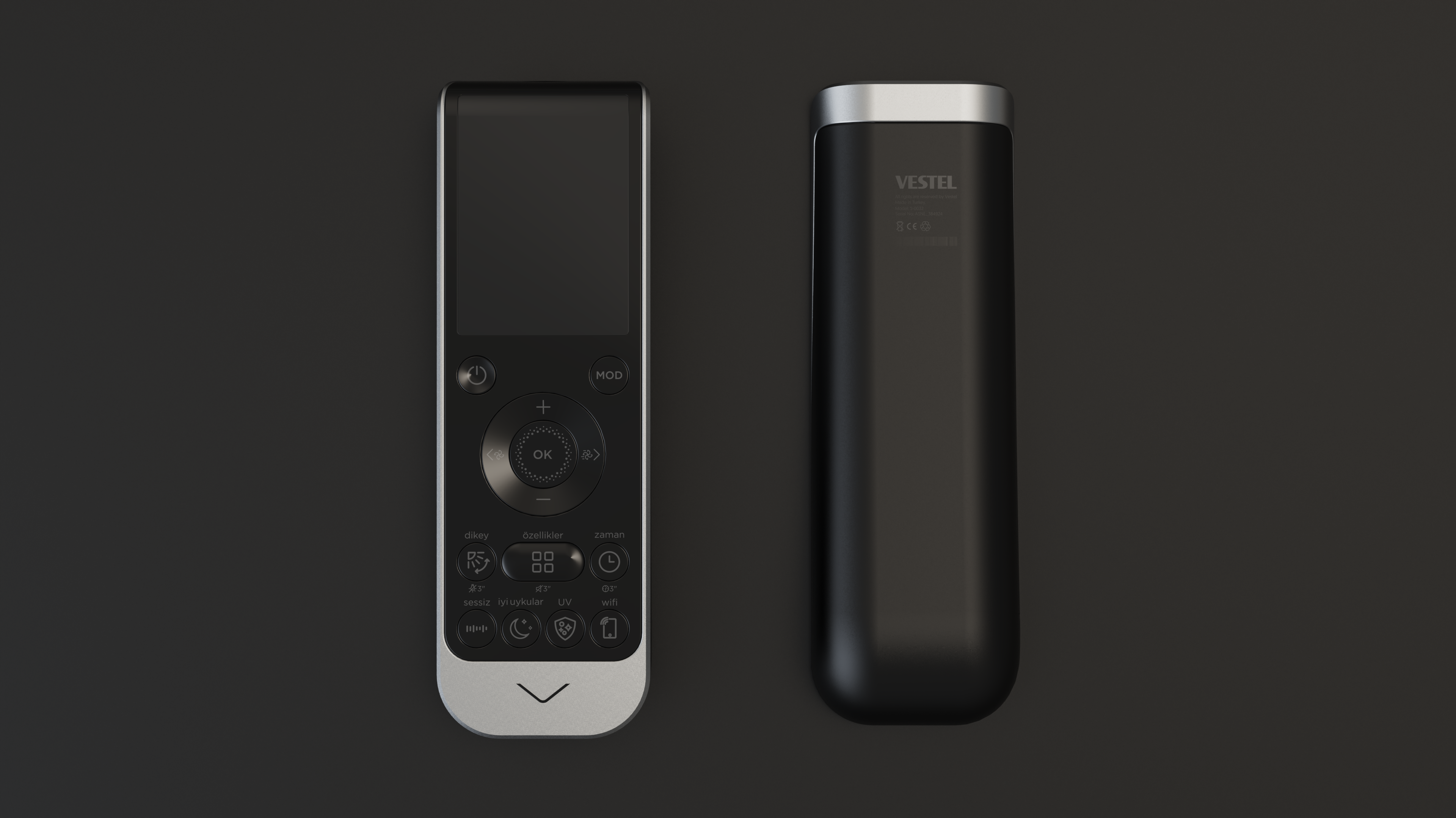
The first design direction for the AC remote is characterized by soft, simple, and harmonious forms. It includes only essential features, with well-thought details integrated into smooth, comforting surfaces. The screen area is distinguished by a high-gloss finish, while the buttons have a matte finish to highlight the interaction areas.
Route 02
Coherent, Defined, Continuous
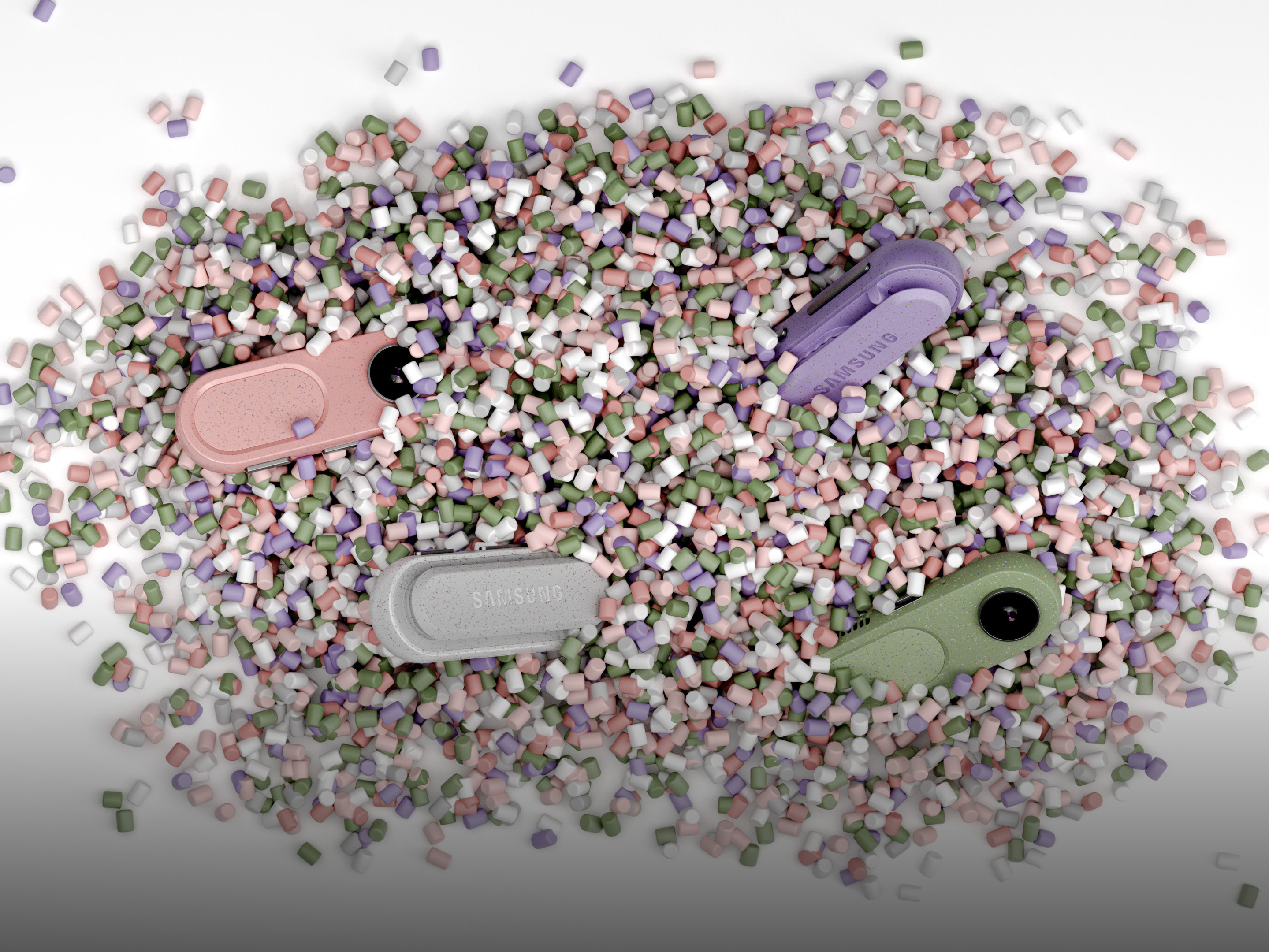
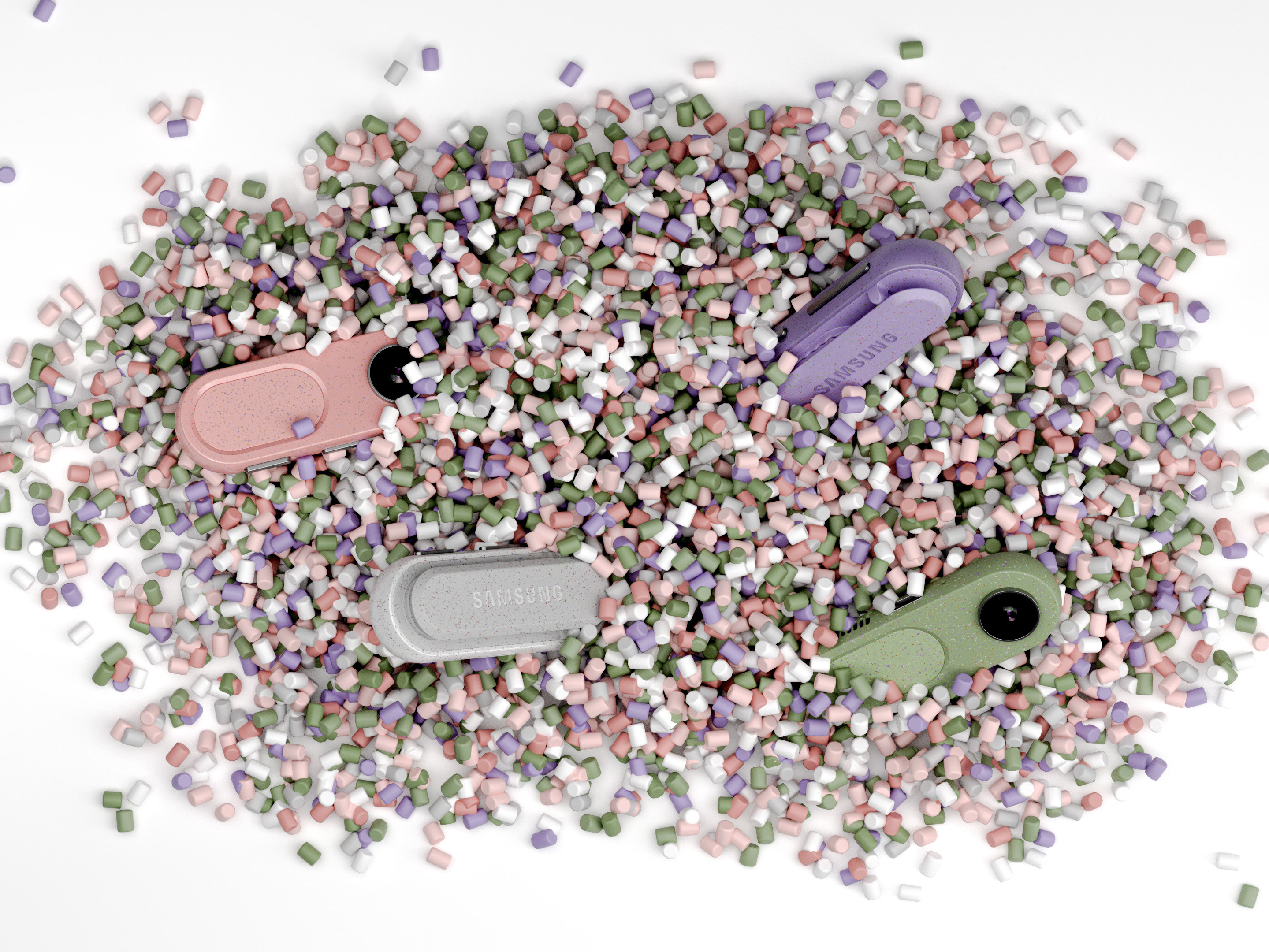
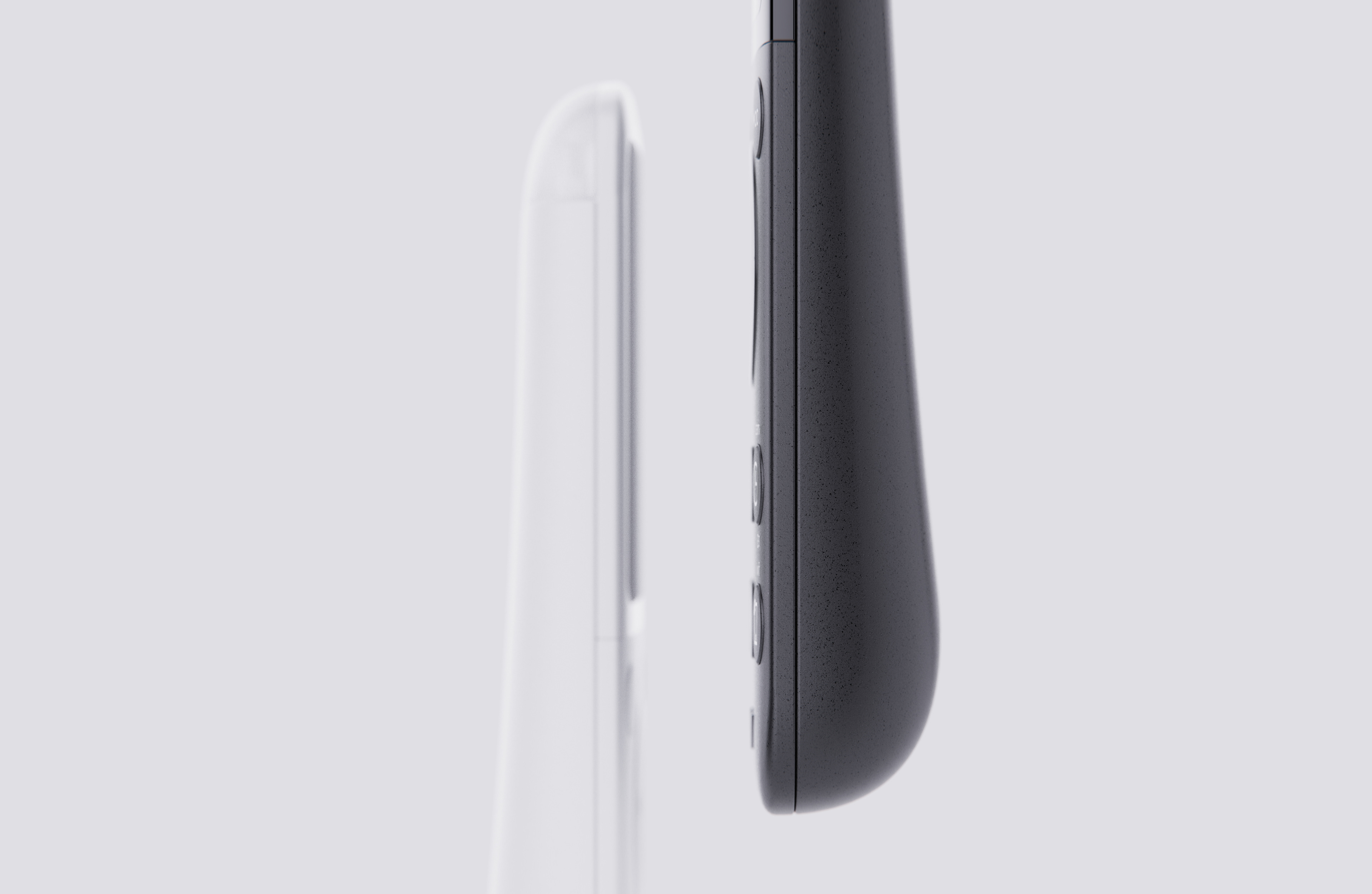
The second design direction for the AC remote features defined, sharp-edged forms that convey a modern and precise aesthetic. It is distinguished by a characteristic frame that can utilize different color materials to enhance customization options.
The flat front surface and flushed buttons contribute to a sleek and streamlined appearance, emphasizing usability and contemporary design principles. This approach not only enhances visual appeal but also offers versatility through material and color choices, ensuring compatibility across diverse market segments.
The flat front surface and flushed buttons contribute to a sleek and streamlined appearance, emphasizing usability and contemporary design principles. This approach not only enhances visual appeal but also offers versatility through material and color choices, ensuring compatibility across diverse market segments.
Prototyping
After finalizing the alternative routes, we proceeded with high-fidelity prototyping. This process involved contacting manufacturers, iterating on designs, and refining the final product.
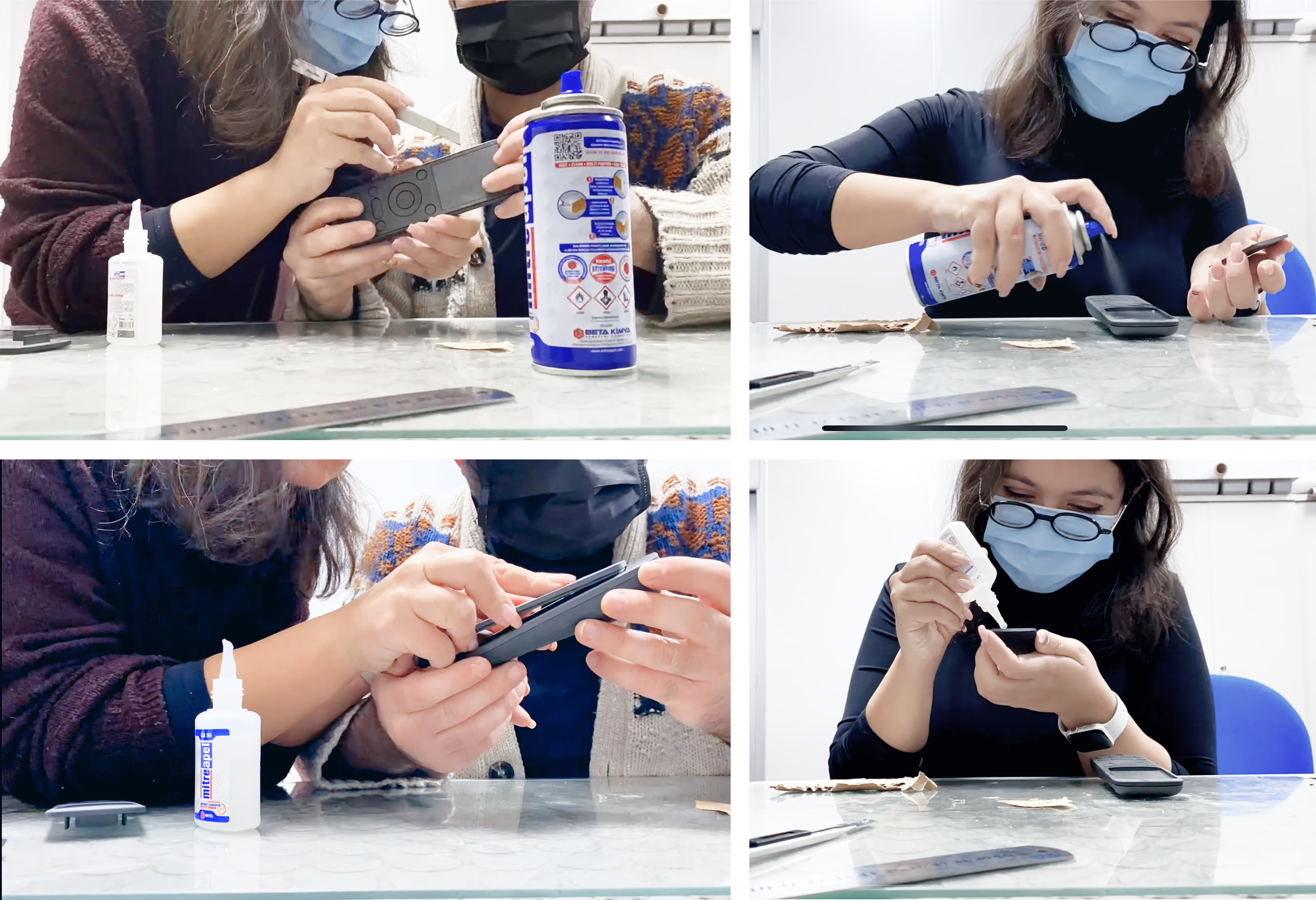
During the prototyping phase, continuous refinements were made through user testing to enhance functionality and overall user experience. Now in production, the project reflects a balance between usability, market expectations, and technical feasibility. Looking ahead, future iterations may explore further optimizations in interaction design, material innovation, and smart integrations to adapt to evolving user needs and technological advancements.